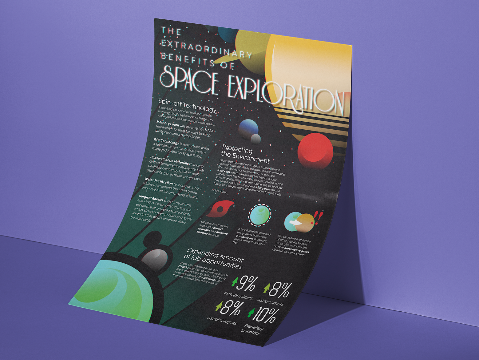
During my senior year of college, I worked at the Marketing & Communications Officer of Student Affairs at Rochester Institute of Technology. The opportunity started out as a summer internship that continued as a part time job during the school year. I primarily worked on digital graphics and flyers that represented / promoted various organizations affiliated with the campus.
Academic Success Center Rebrand
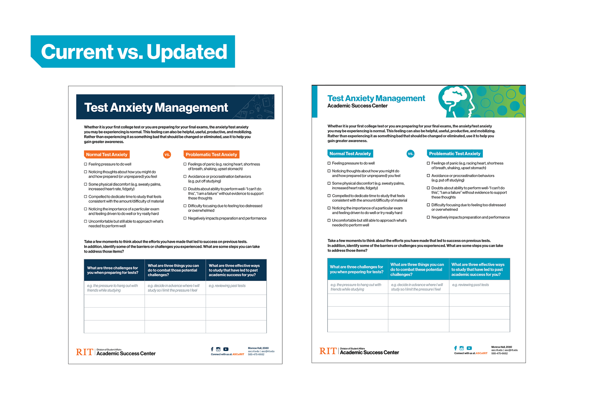
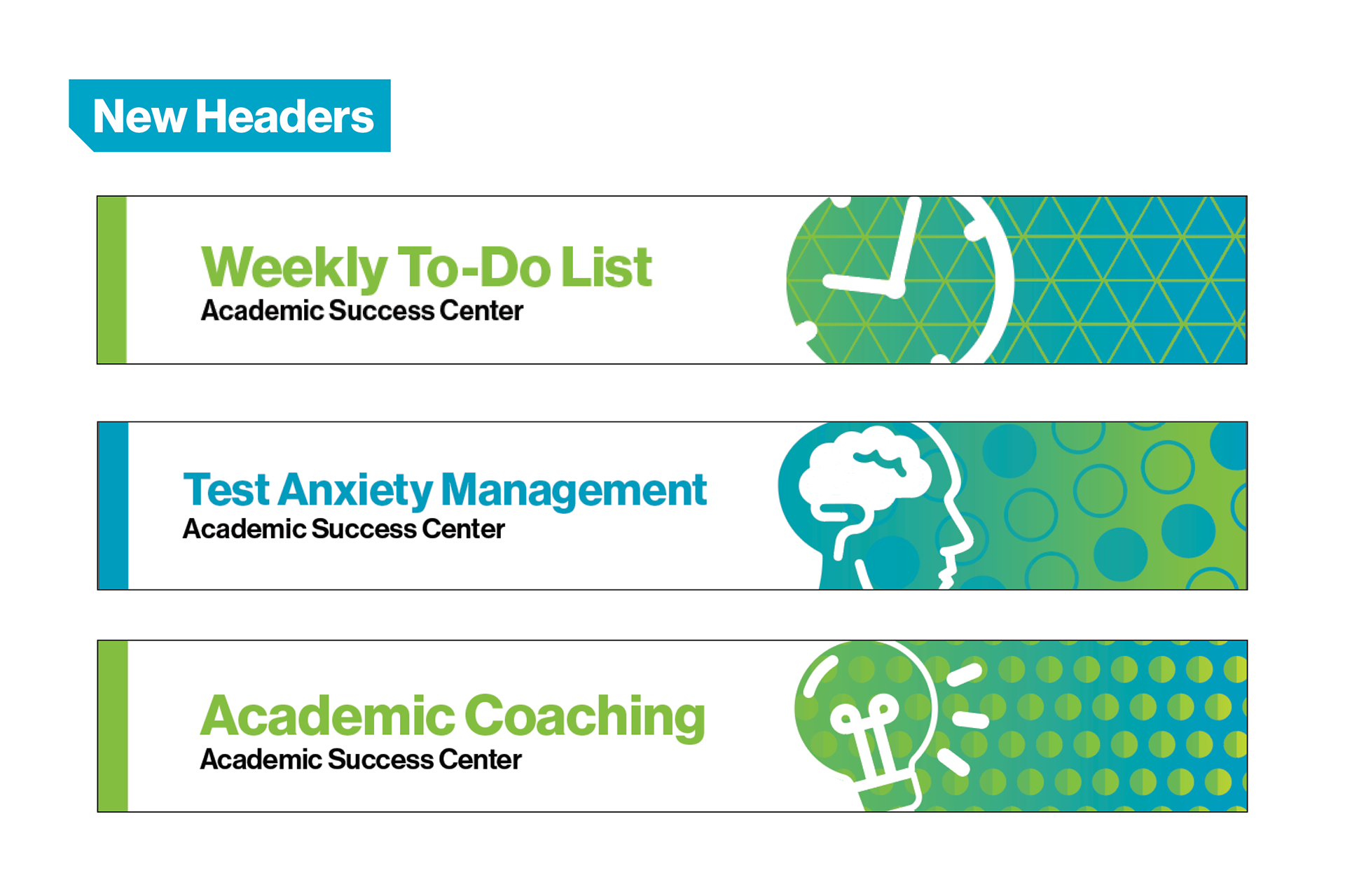
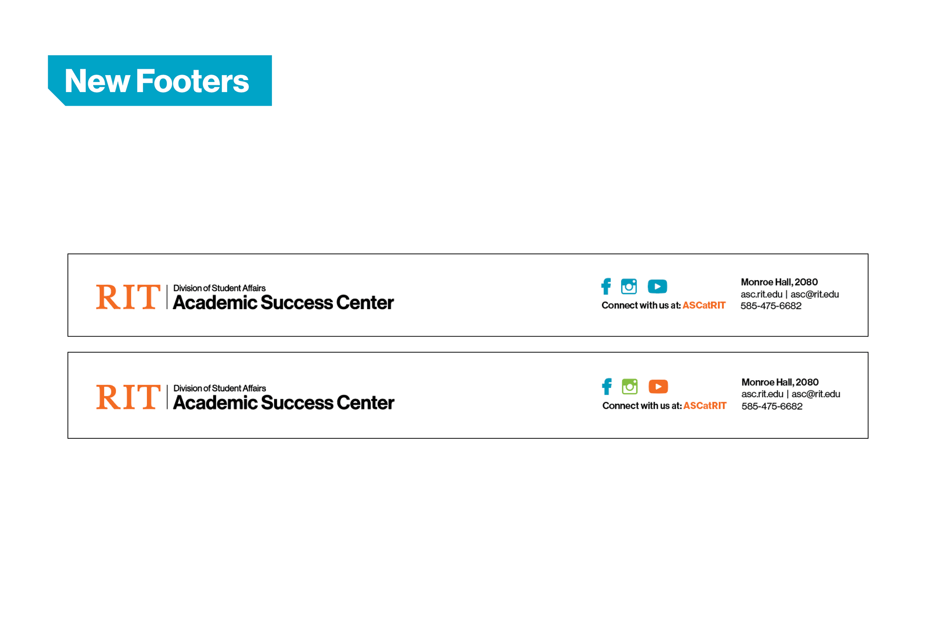
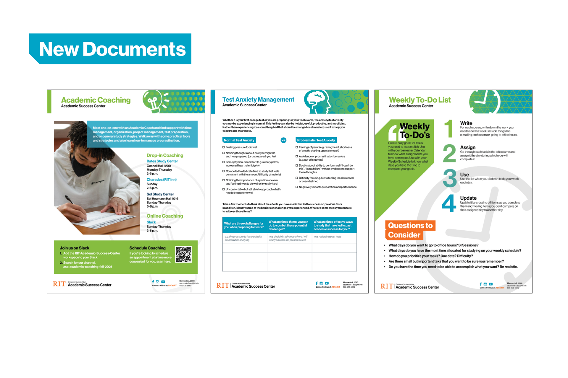
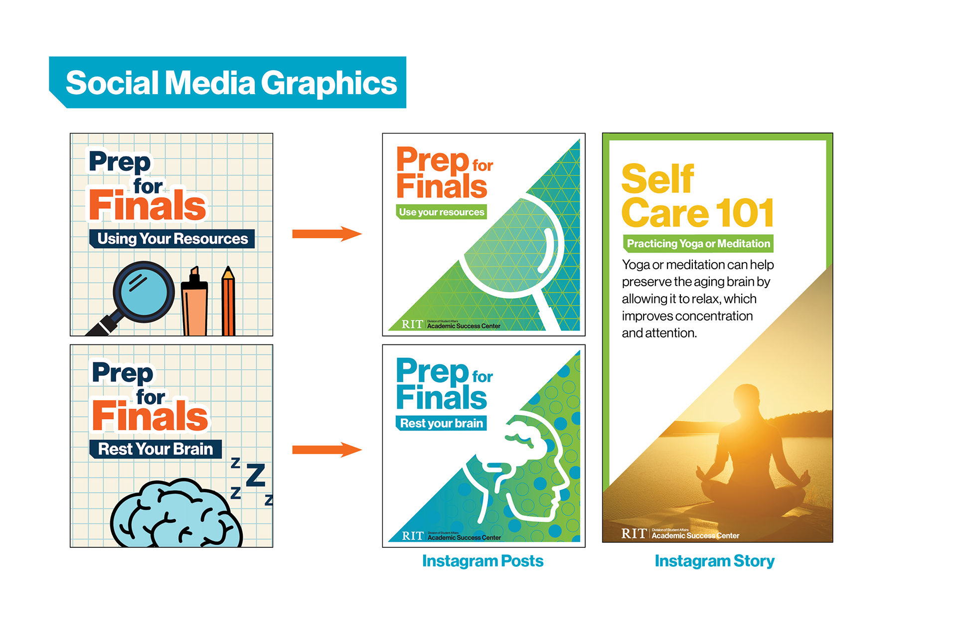
One of my first major projects was to redesign the branding for the campus's Academic Success Center, which is a resource for students who are struggling academically that gives them the additional help they need. For this rebrand,
I used simple iconography to denote different topics, such as a clock representing material relating to time management, and a brain representing material relating to easing anxiety. Additionally, I used the standard colors included in our campus's brand identity so the material is more cohesive and recognizable.
I used simple iconography to denote different topics, such as a clock representing material relating to time management, and a brain representing material relating to easing anxiety. Additionally, I used the standard colors included in our campus's brand identity so the material is more cohesive and recognizable.
RIT Counseling Embedded Location Flyers
I was tasked with creating flyers that would make students aware of the different counselors available for their particular college. A picture of the counselor and their contact information would be put onto the white empty space after the flyers are printed out. The pictures can be easily swapped out if the counselor changes without needing to completely redo the flyers.

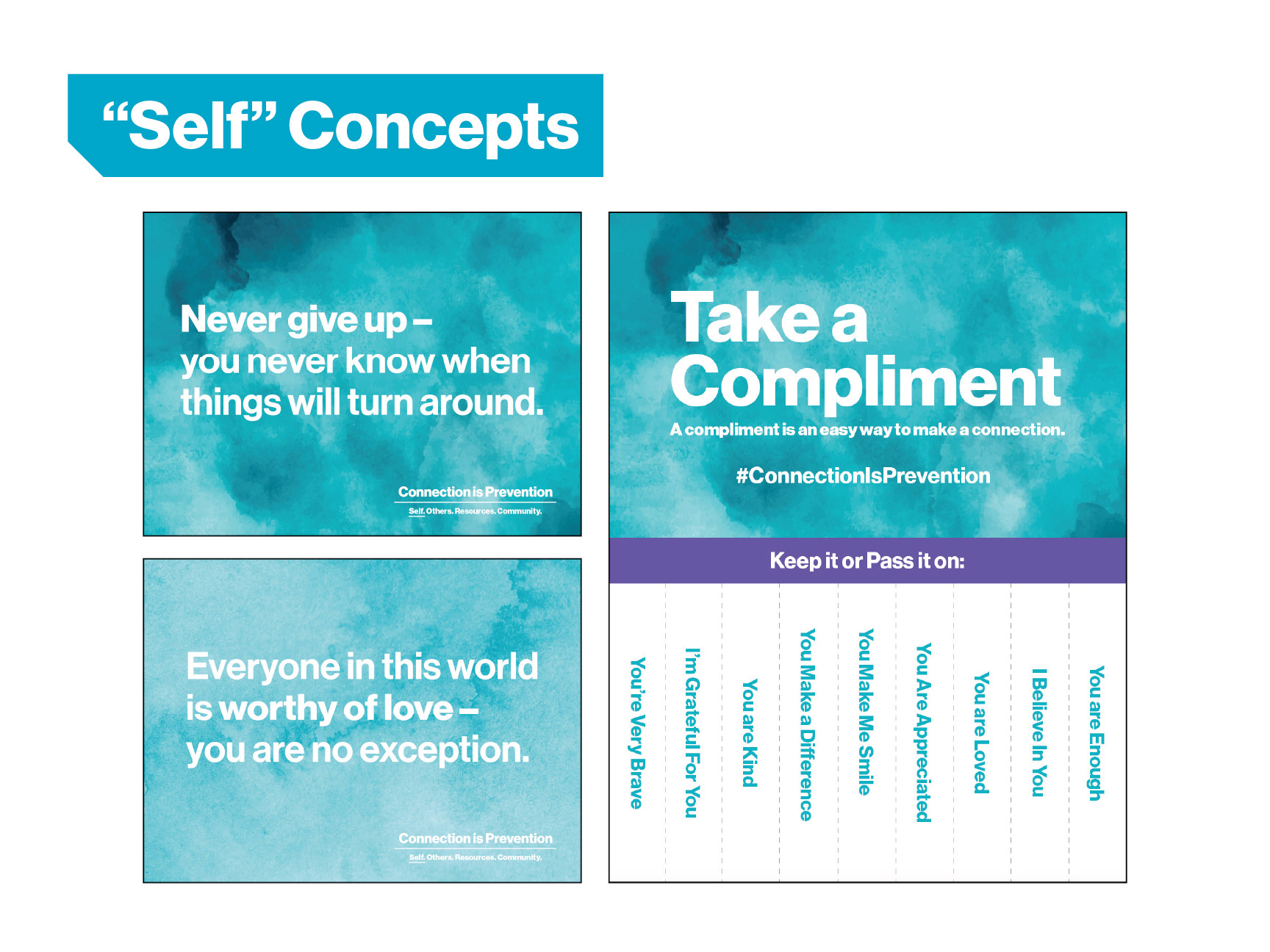
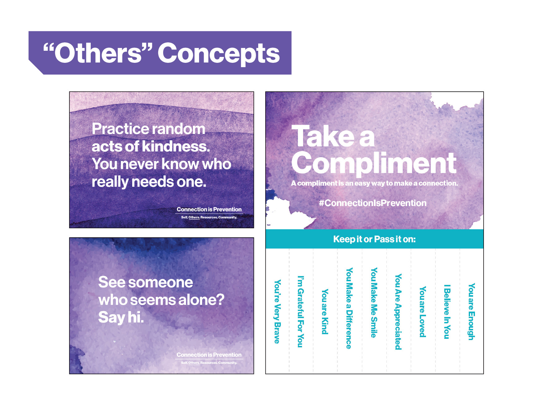
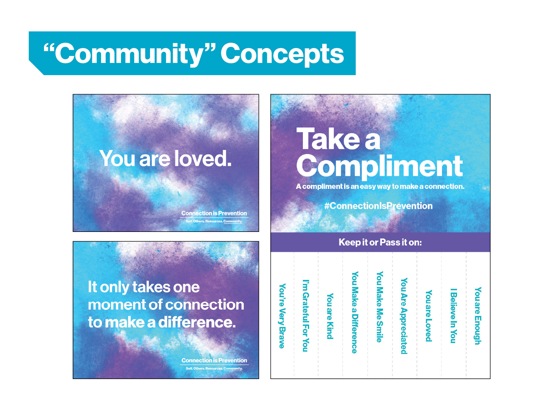
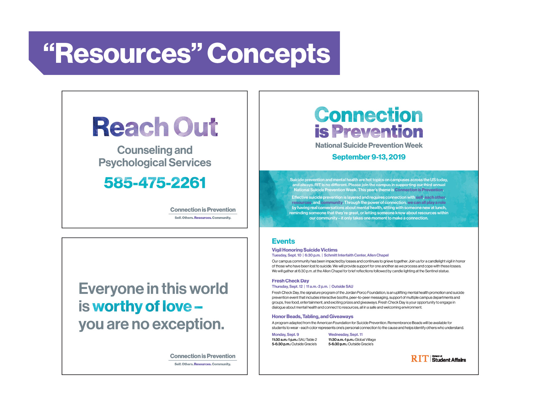
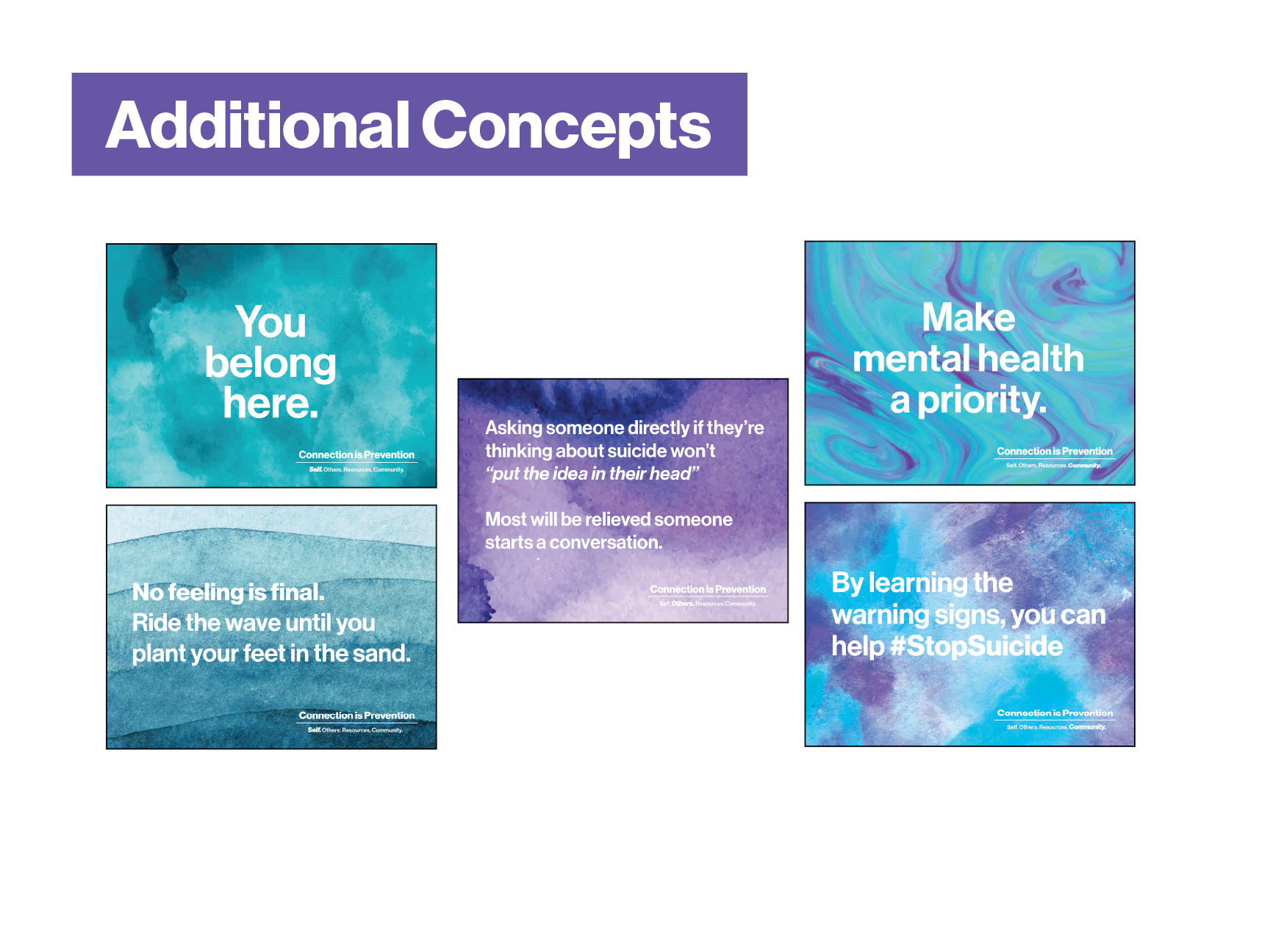
National Suicide Prevention Week
Branding Refresh
Branding Refresh
One of my bigger projects was refreshing the branding for our school's presentation of National Suicide Prevention Week. I used relaxing gradients and tie-dye patterns to create a sense of calm and understanding when paired with motivational quotes.
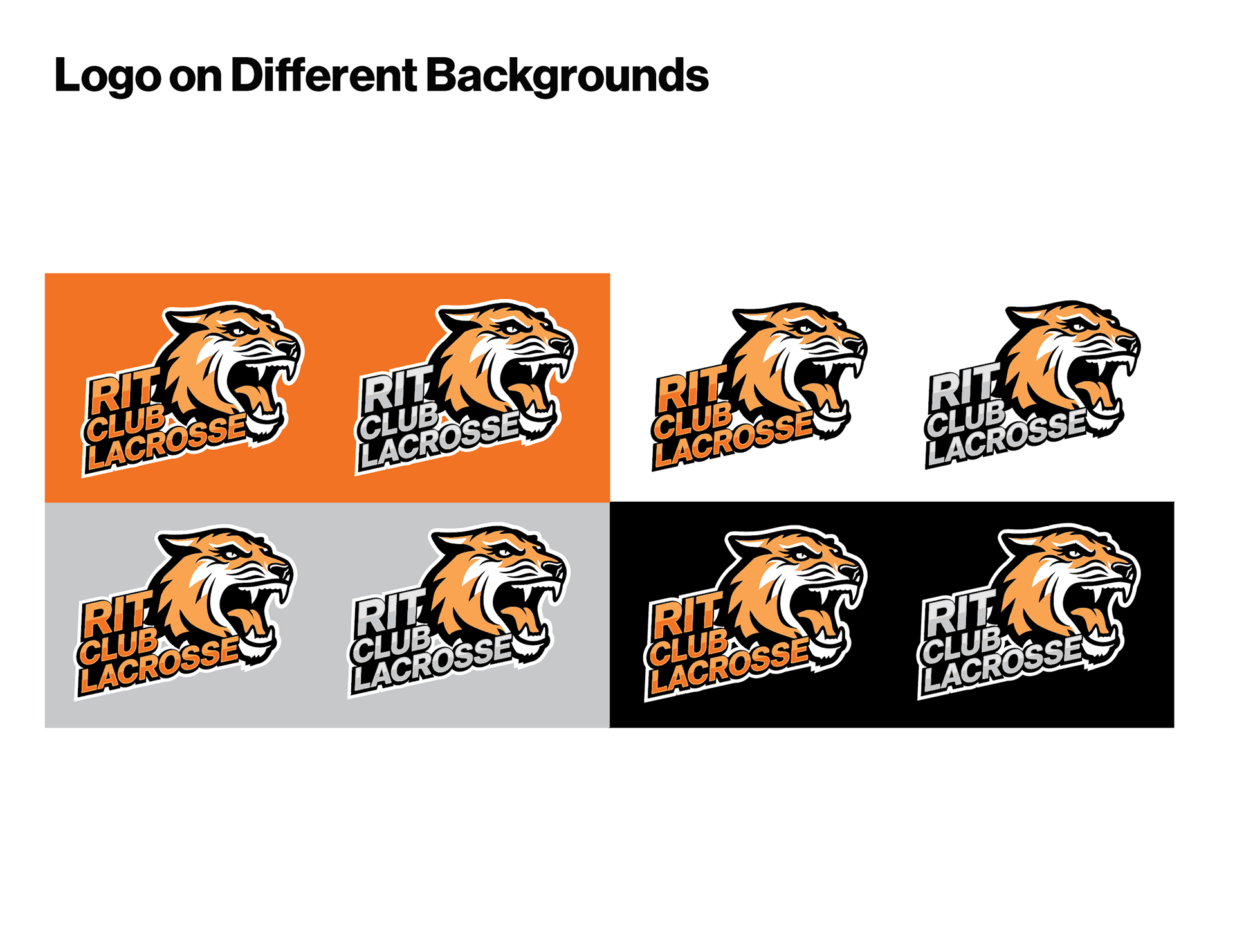
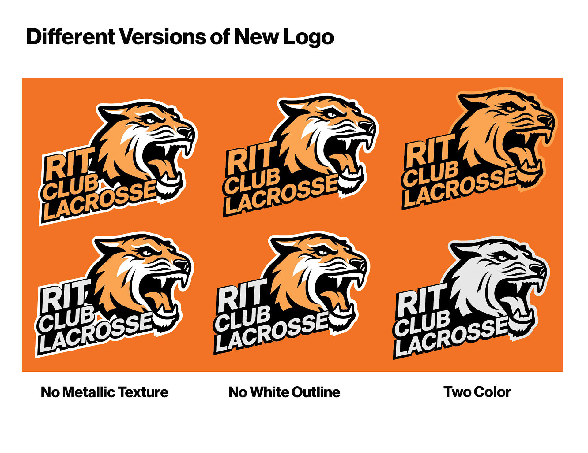
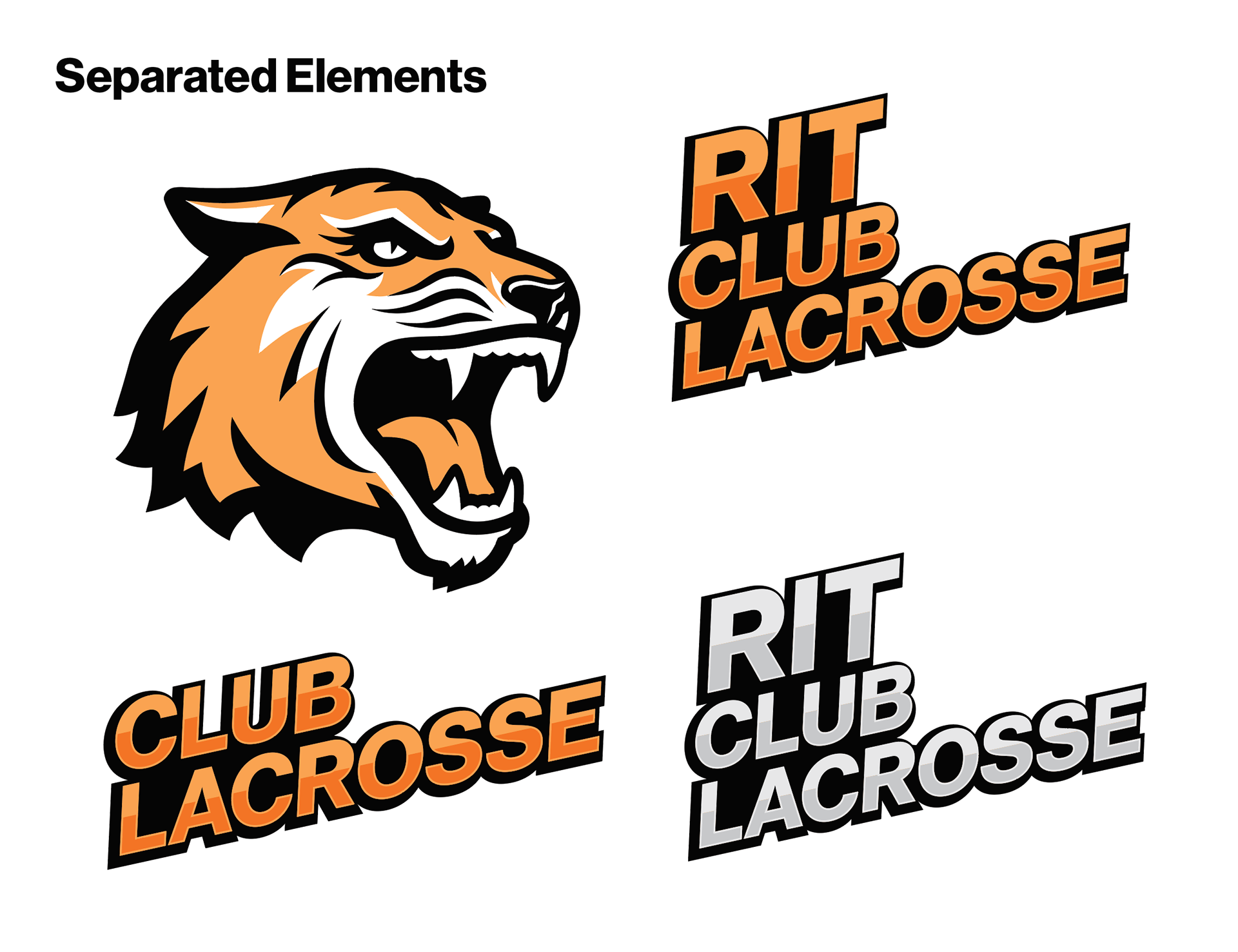
RIT Club Sports Logo Concept
One point of controversy regarding the logos of our school's clubs is that they were all very different from each other,
so I was tasked with creating a concept that made them all more cohesive and tied them better to the identity of our school. Through this, I used our school's tiger iconography, in addition to dynamic, yet simple, type that could be used as an alternative to the clubs' existing logos.
so I was tasked with creating a concept that made them all more cohesive and tied them better to the identity of our school. Through this, I used our school's tiger iconography, in addition to dynamic, yet simple, type that could be used as an alternative to the clubs' existing logos.