Free Verse is a fictional poetry bookshop and café based in Philadelphia. As someone who loves reading and writing poetry, as well as places with a relaxing atmosphere, I thought this would be a place that I would personally love to design for. I used this as an opportunity to create a brand that speaks to a specific target audience, as well as one that is consistent and cohesive throughout all deliverables.
Target Audience and Visual Guidelines
Being a poetry bookshop and café, Free Verse would have a multitude of poetry books available to both buy or check out temporarily. In addition to having a section to have breakfast and lunch, the bookshop will serve as an area where people can relax to read and write poetry, as well as connect with others who have the same interest. There would also be special events that take place such as writing workshops and open mic nights.
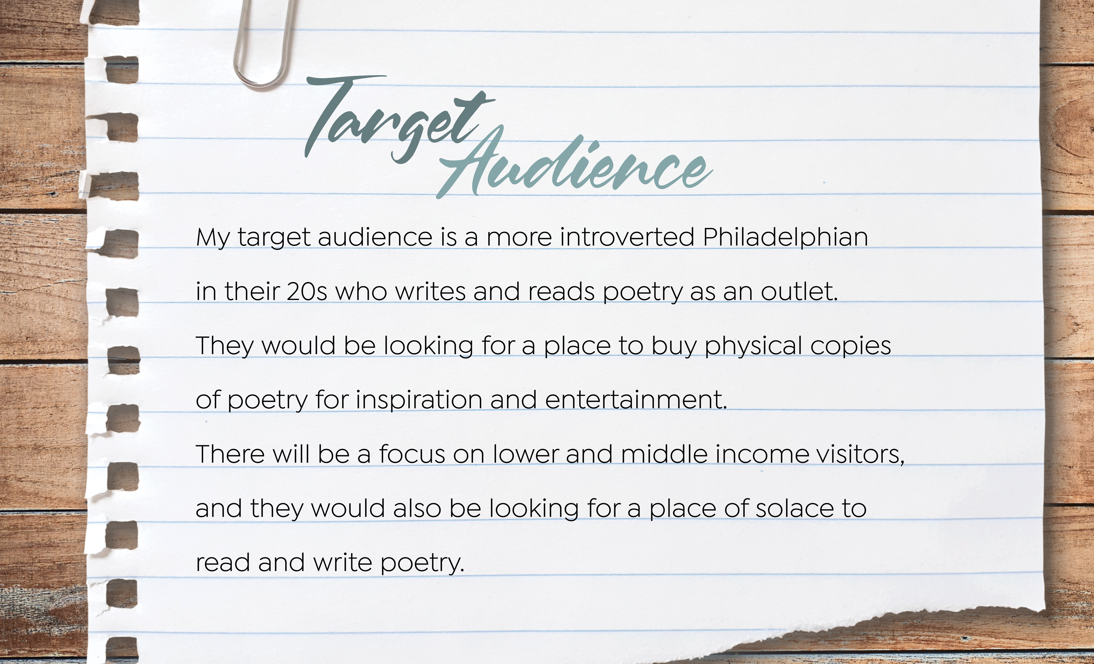
My primary goal in developing this brand was to make sure that it represents the atmosphere and purpose of the bookshop café accurately. Because the target audience is going to be more creative, quiet, and thoughtful, I knew
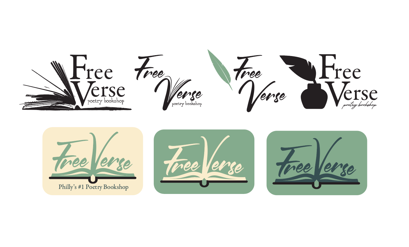
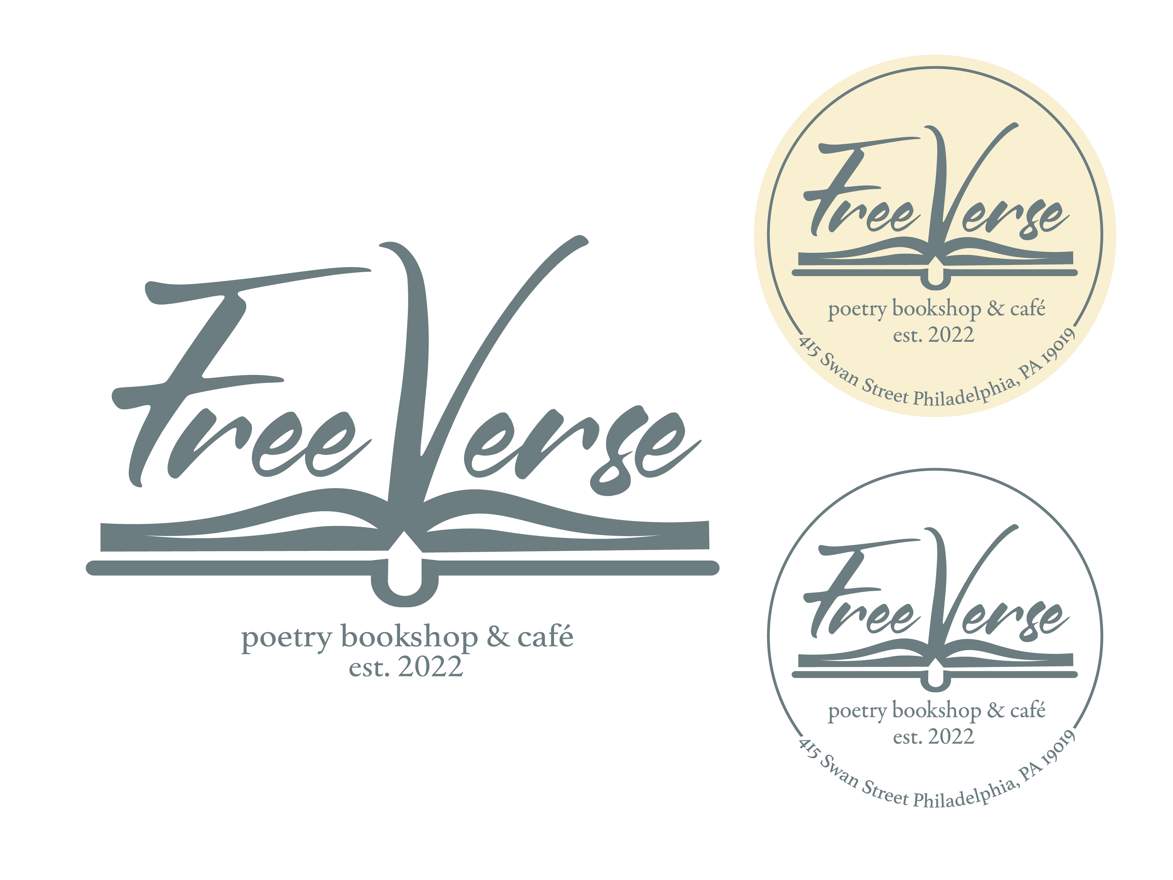
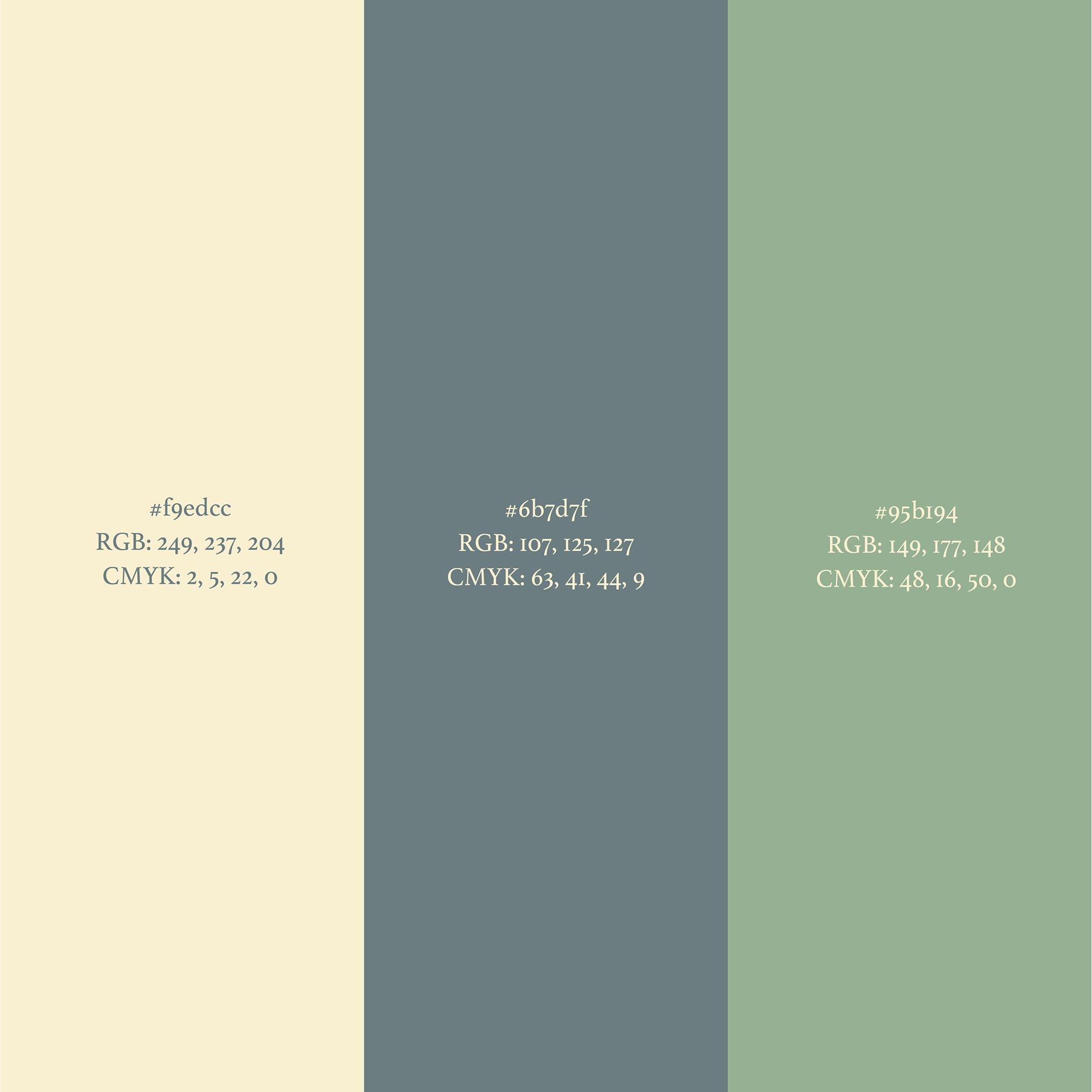
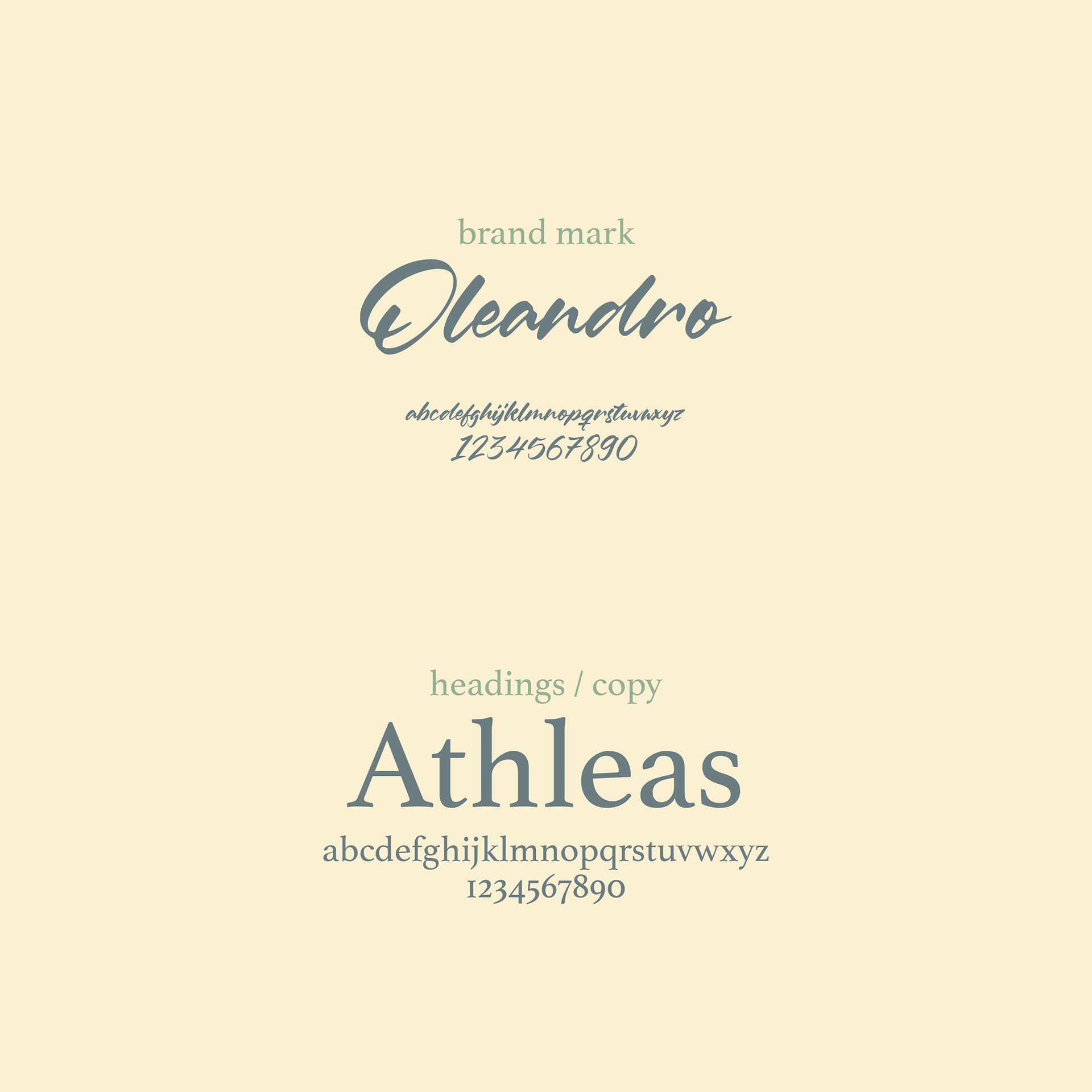
that I could reflect this in the brand's visuals by using more relaxing earth tones like green and beige. The "Free Verse" type itself is in a script typeface to reflect the handwritten nature of poetry, complemented by serif subtitles.
that I could reflect this in the brand's visuals by using more relaxing earth tones like green and beige. The "Free Verse" type itself is in a script typeface to reflect the handwritten nature of poetry, complemented by serif subtitles.
Deliverables
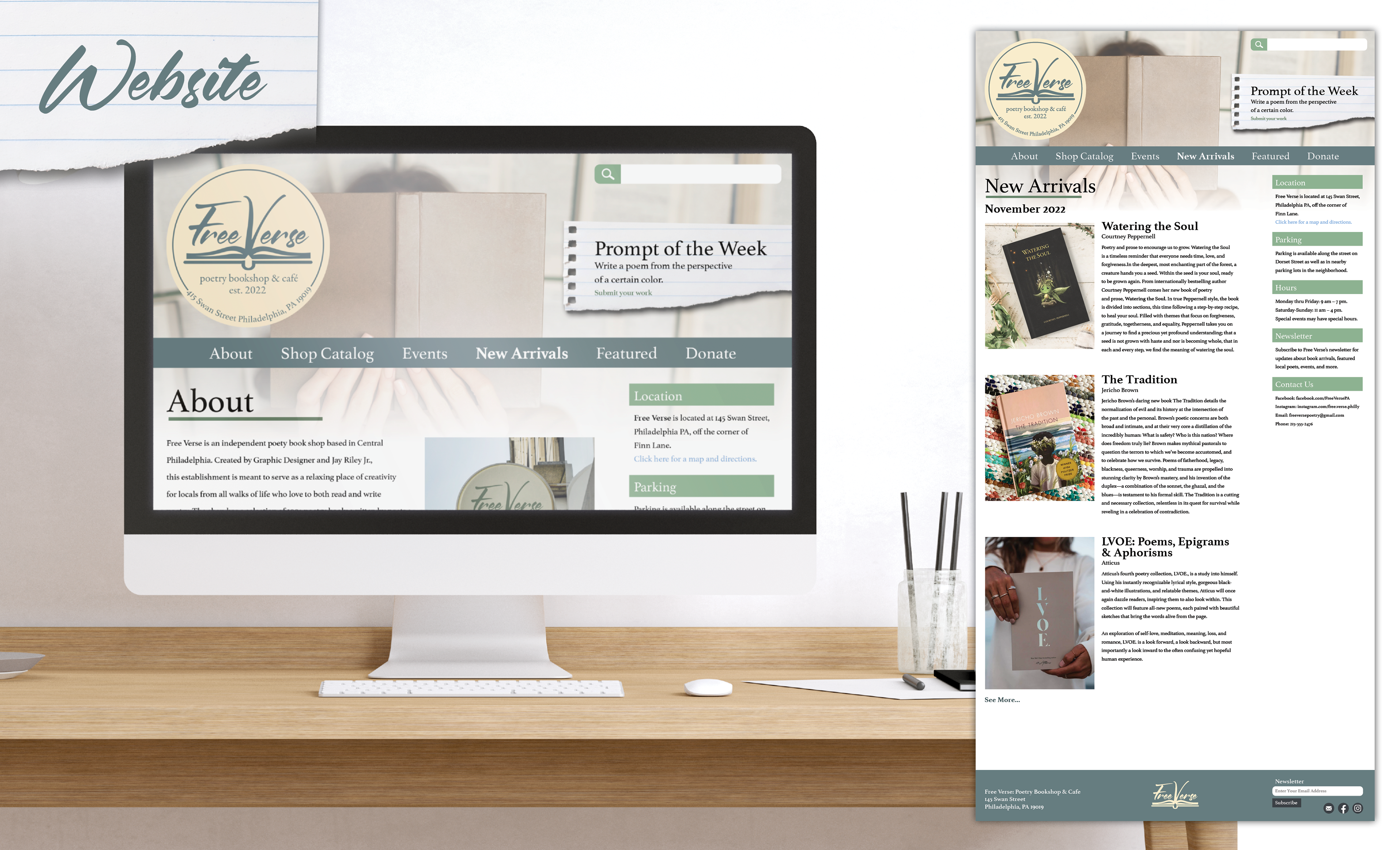
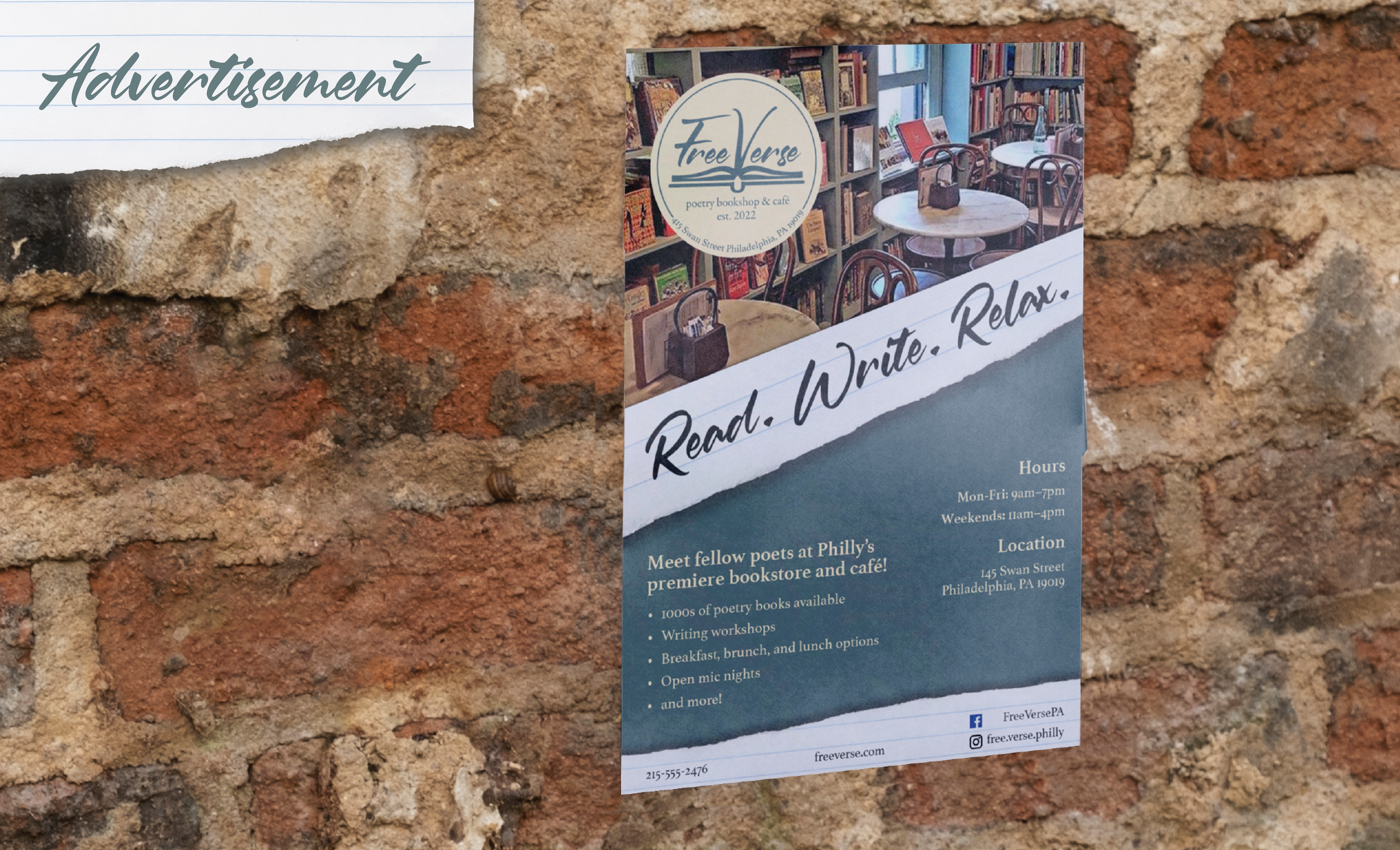
All of the aspects of the brand that I created were not just based on what I thought "looked nice", but were instead geared to what I believed the target audience would be attracted to. They all serve as things you would see or buy from a real life bookshop café, including both advertising methods and merchandise.
Location-based Design
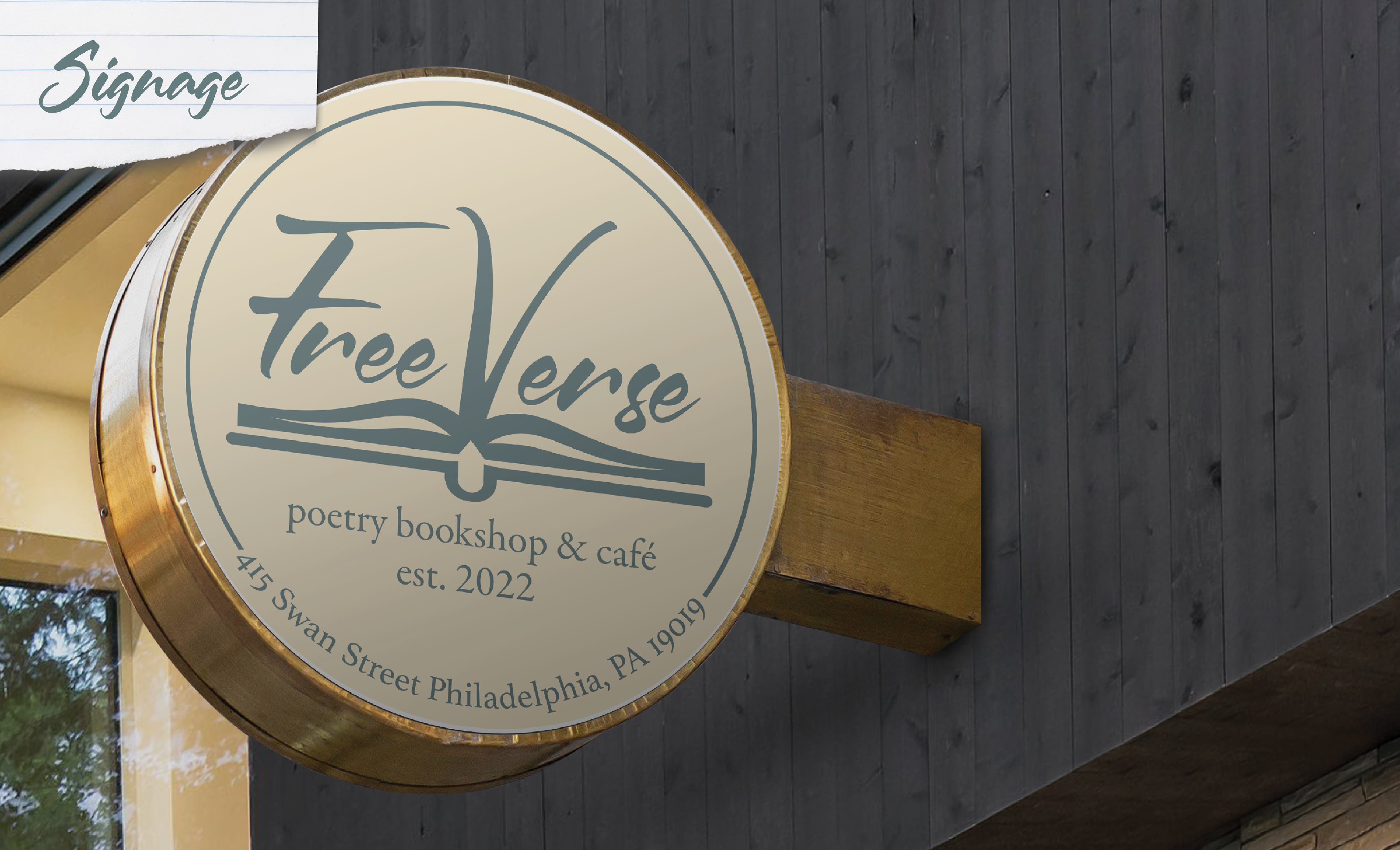
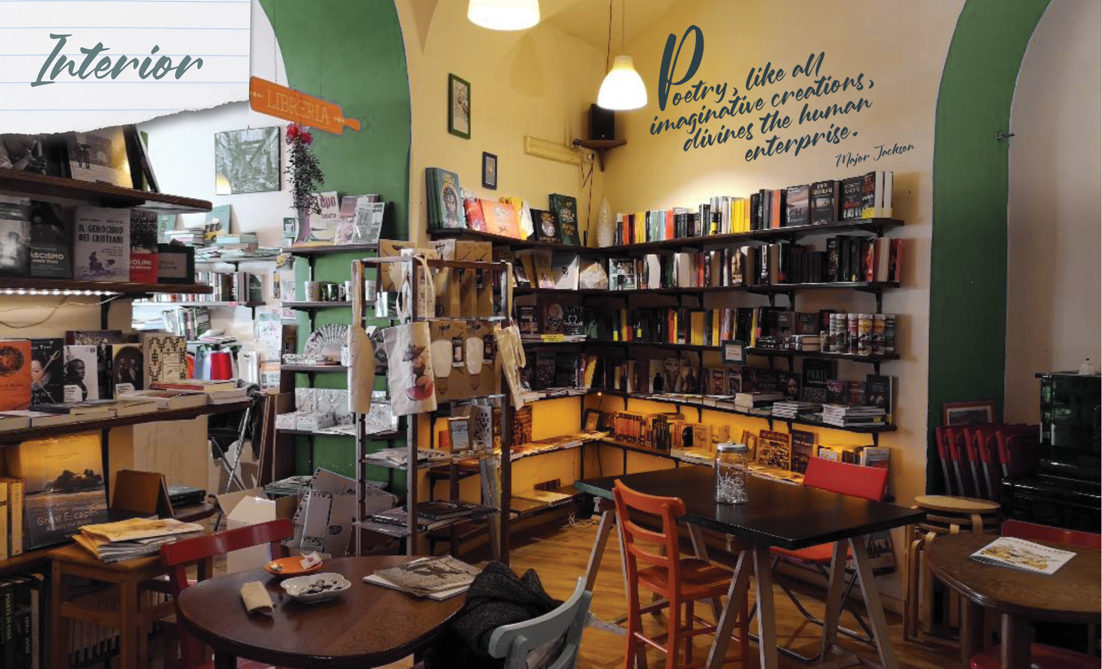
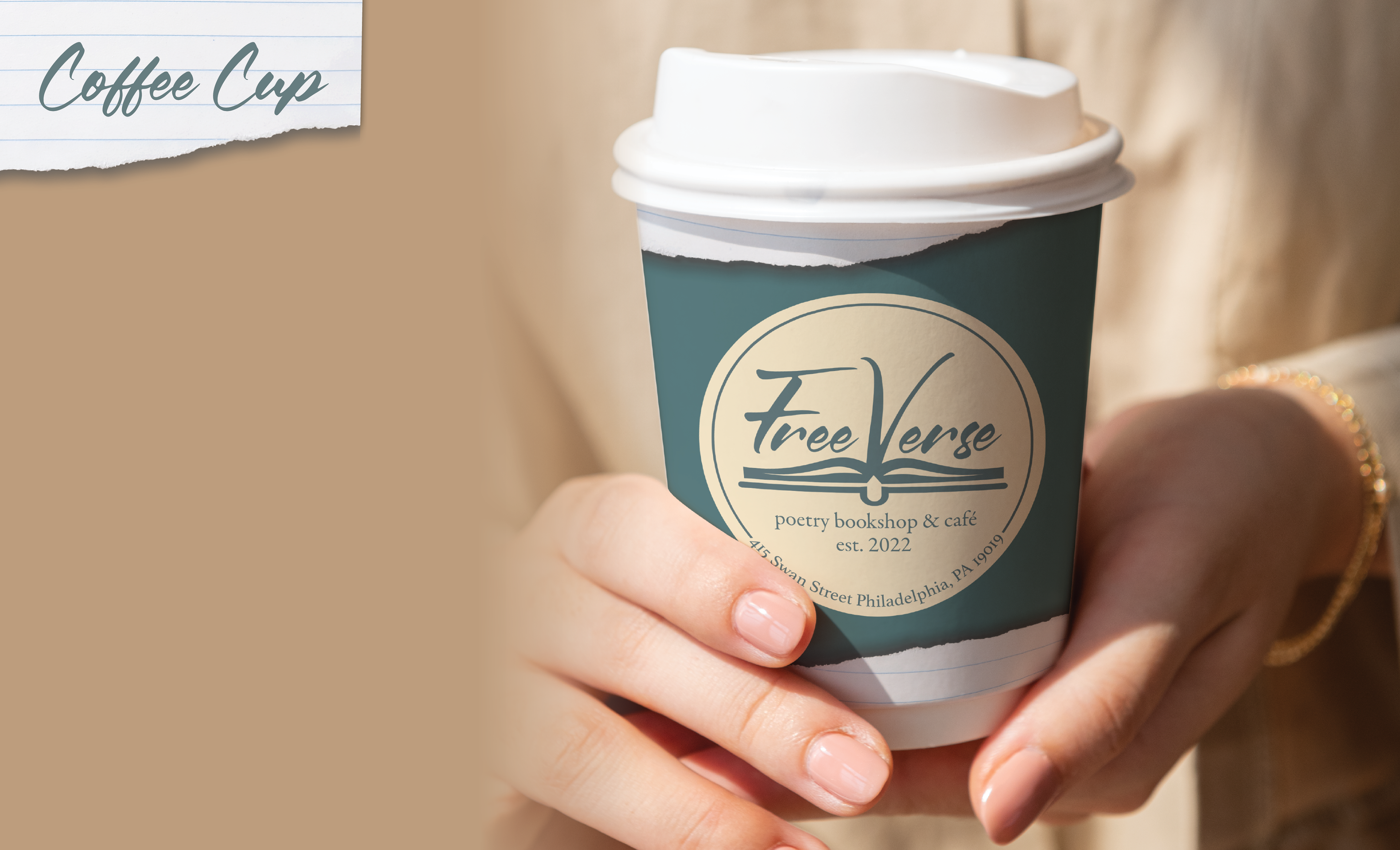
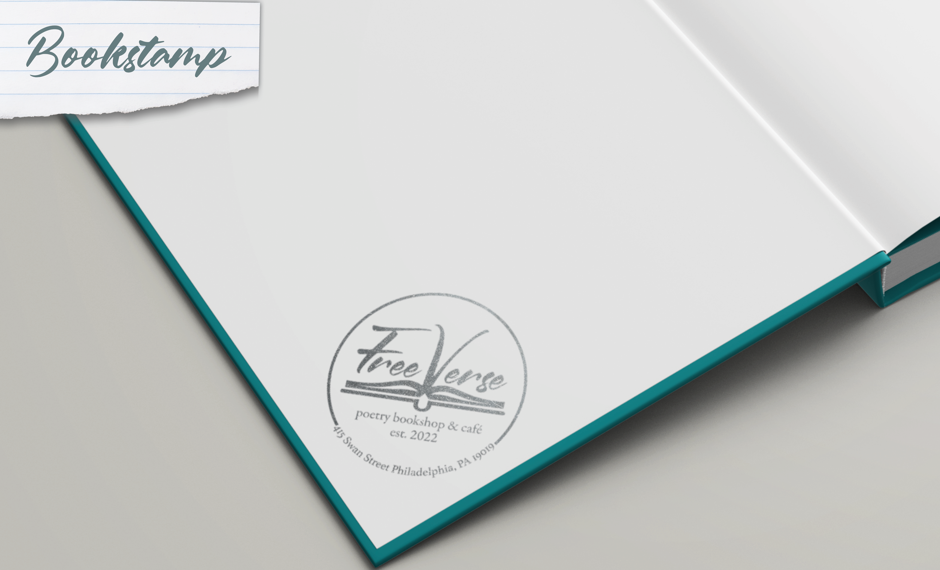
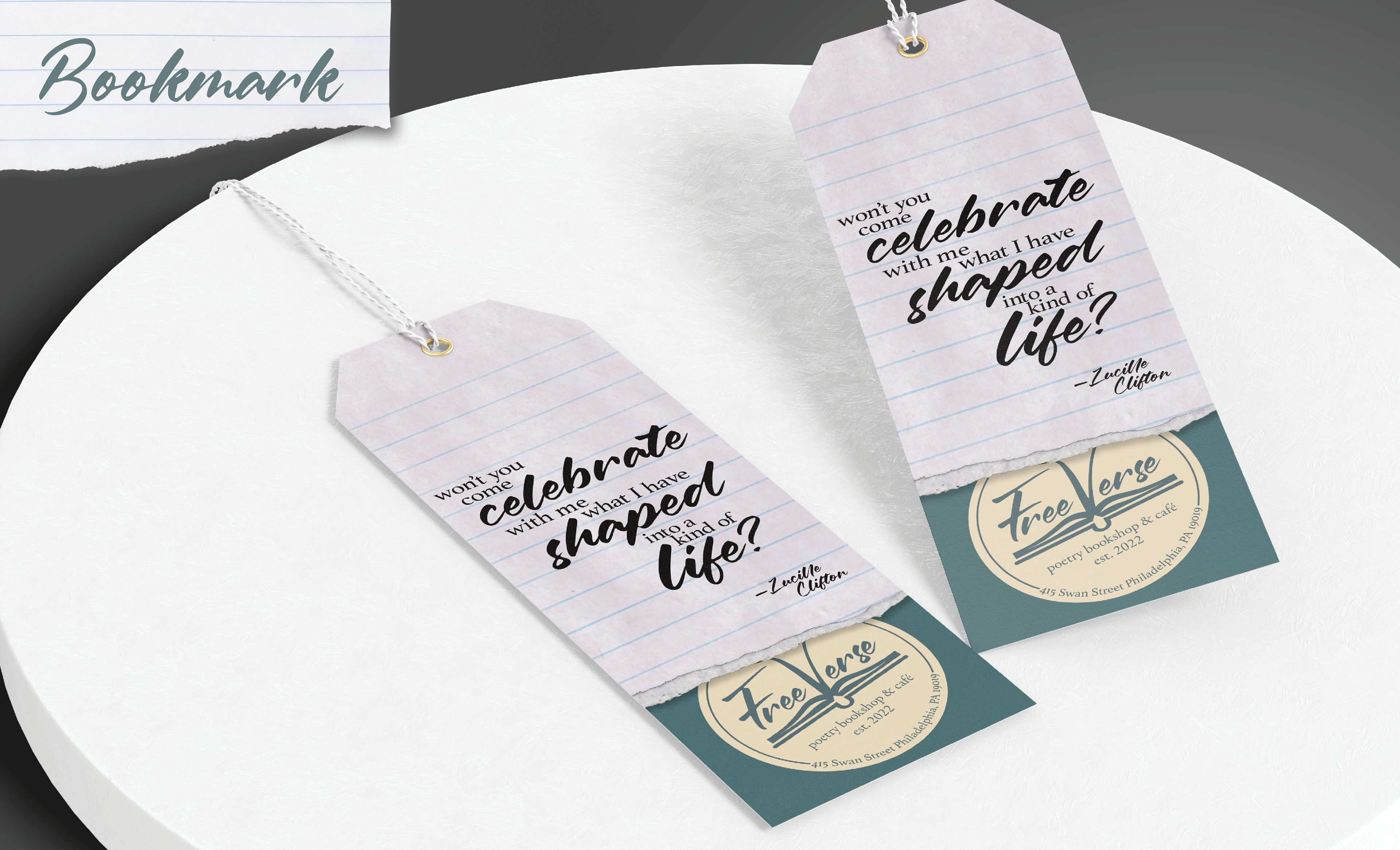
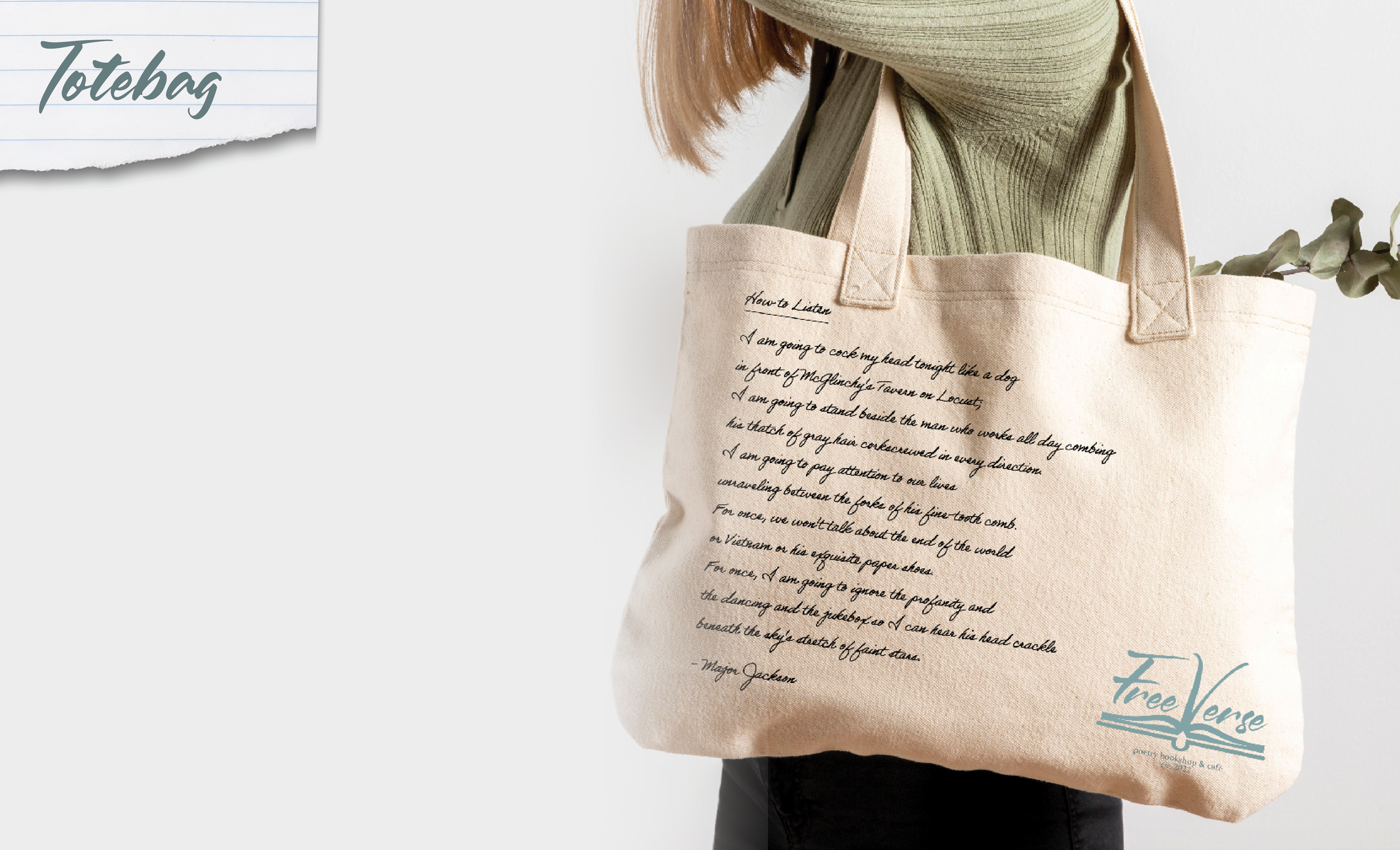
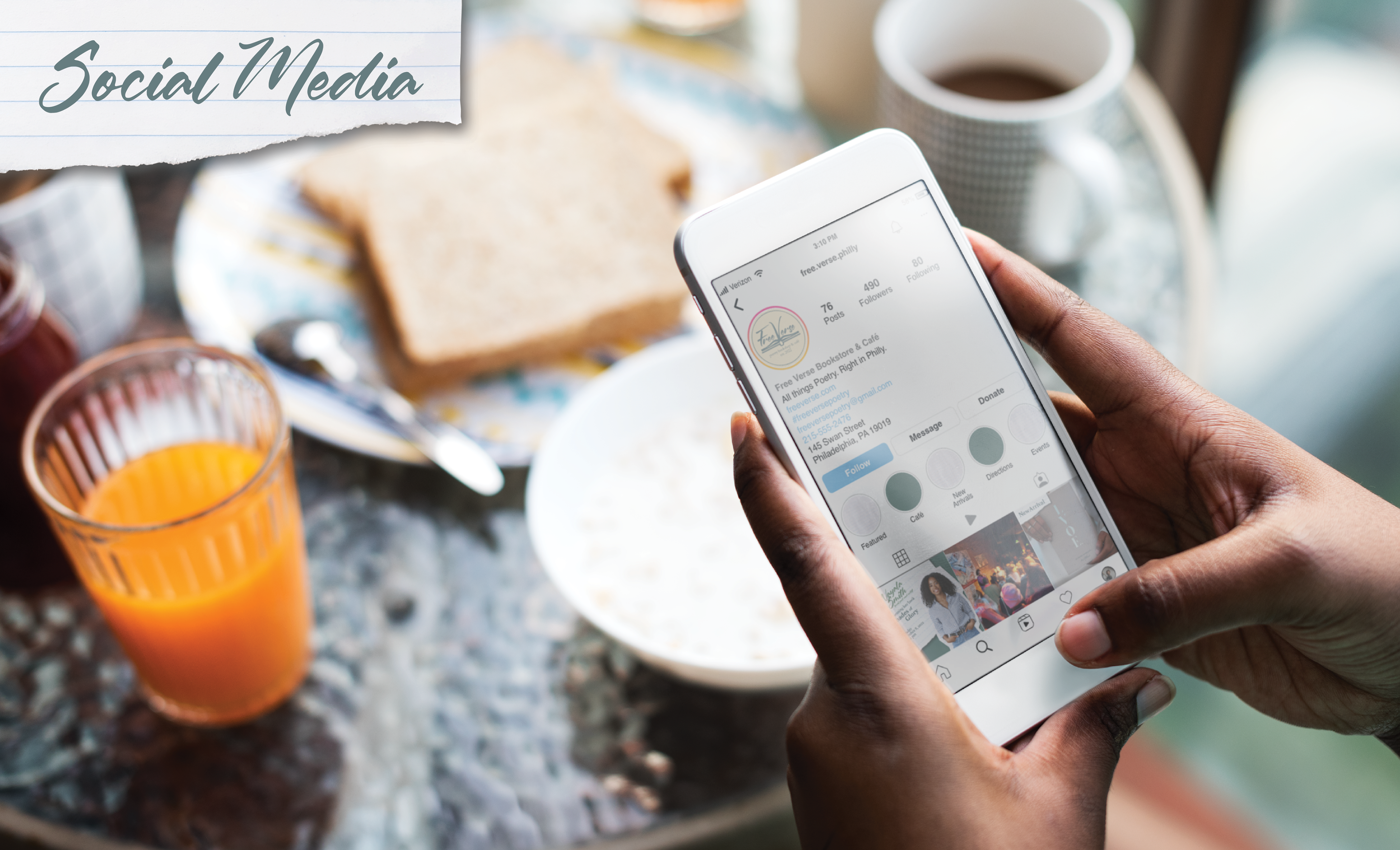
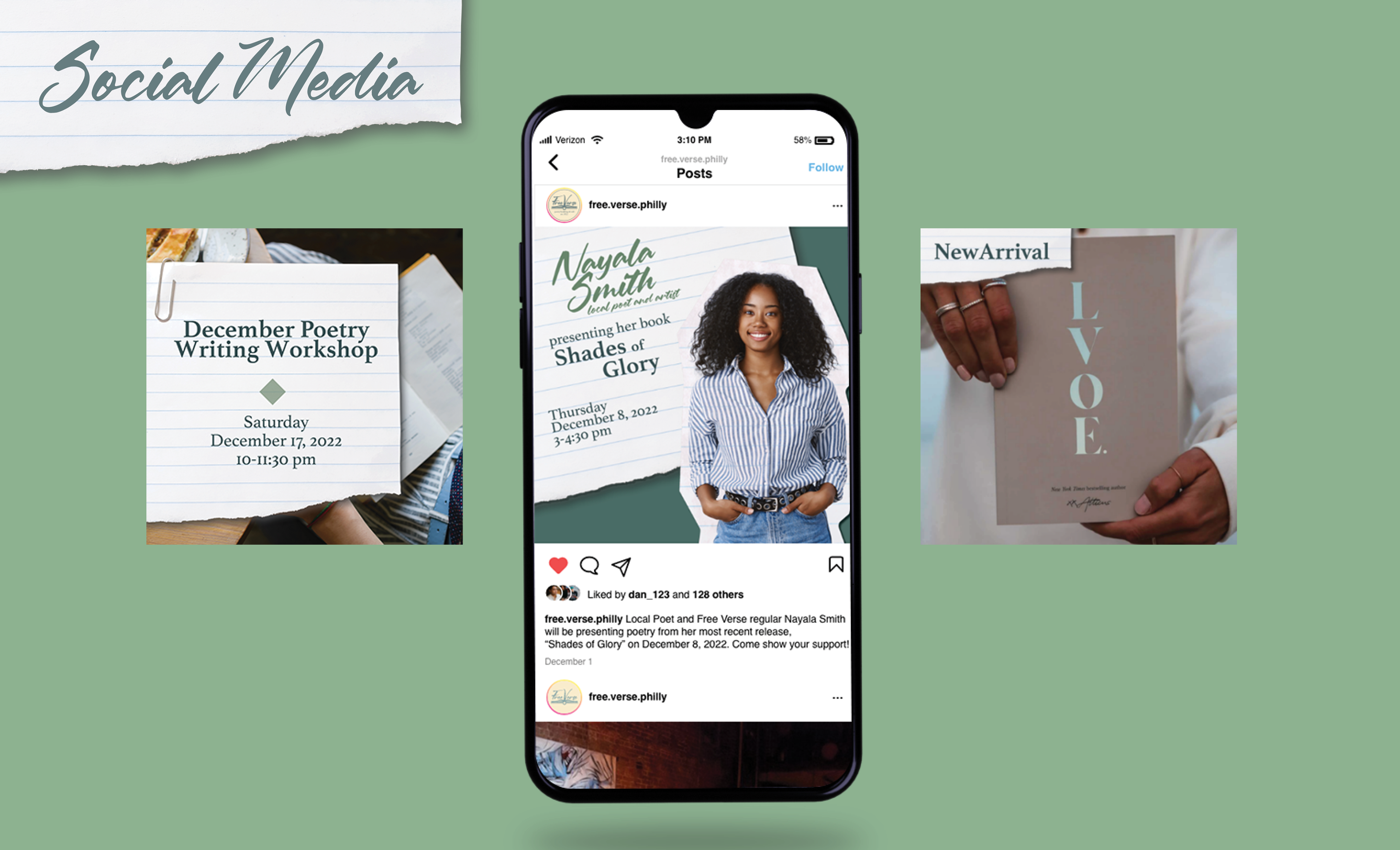
Much of this independent shop's purpose is to act as a sanctuary for poetry enthusiasts, especially local poets. That is why there would be a focus on showcasing the work of local poets through social media advertising and merchandise given out from the brand. As an example, the quotes on the tote bag, bookmarks, and wall decals are all from Philadelphian poets. With the consistent use of the dark teal and beige, the brand mark, and the ripped paper details that speak to handwritten poetry, I want to make sure that potential regulars automatically get a sense of what
Free Verse is and why they may want to visit.
Free Verse is and why they may want to visit.
Merchandise
Advertising
Process Work
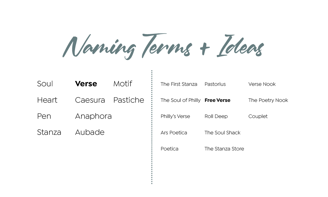
When I first thought of the idea for the brand, I wanted to create a name that immediately lets people know that the bookshop relates to poetry specifically. While researching different poetry terms, I felt that "Free Verse" was a great fit as it is not only a type of poetry, but it also alludes to the relaxing and nonjudgmental atmosphere of the space.
When creating the mark, I at first was going towards the direction of more classical poetry (as seen with the
Old Style serif typeface and quill), but felt that this kind of aesthetic would not actually resonate with my target audience. Instead, I decided to bring in book imagery that more easily conveys that it is a bookshop, and a script typeface that feels a bit more modern without being geometric.
Old Style serif typeface and quill), but felt that this kind of aesthetic would not actually resonate with my target audience. Instead, I decided to bring in book imagery that more easily conveys that it is a bookshop, and a script typeface that feels a bit more modern without being geometric.
