Cardinal Inflight Amenities is a packaging design project created by myself, fellow Graphic Design student
Hannah Zalewski, Industrial Design student Alyssa Tenny, and Packaging Science students Noah Baumgaertel and Manjiri Ranade. The brief of the project was to create a packaging brand that emphasizes sustainability and
also is biodegradable.
Hannah Zalewski, Industrial Design student Alyssa Tenny, and Packaging Science students Noah Baumgaertel and Manjiri Ranade. The brief of the project was to create a packaging brand that emphasizes sustainability and
also is biodegradable.
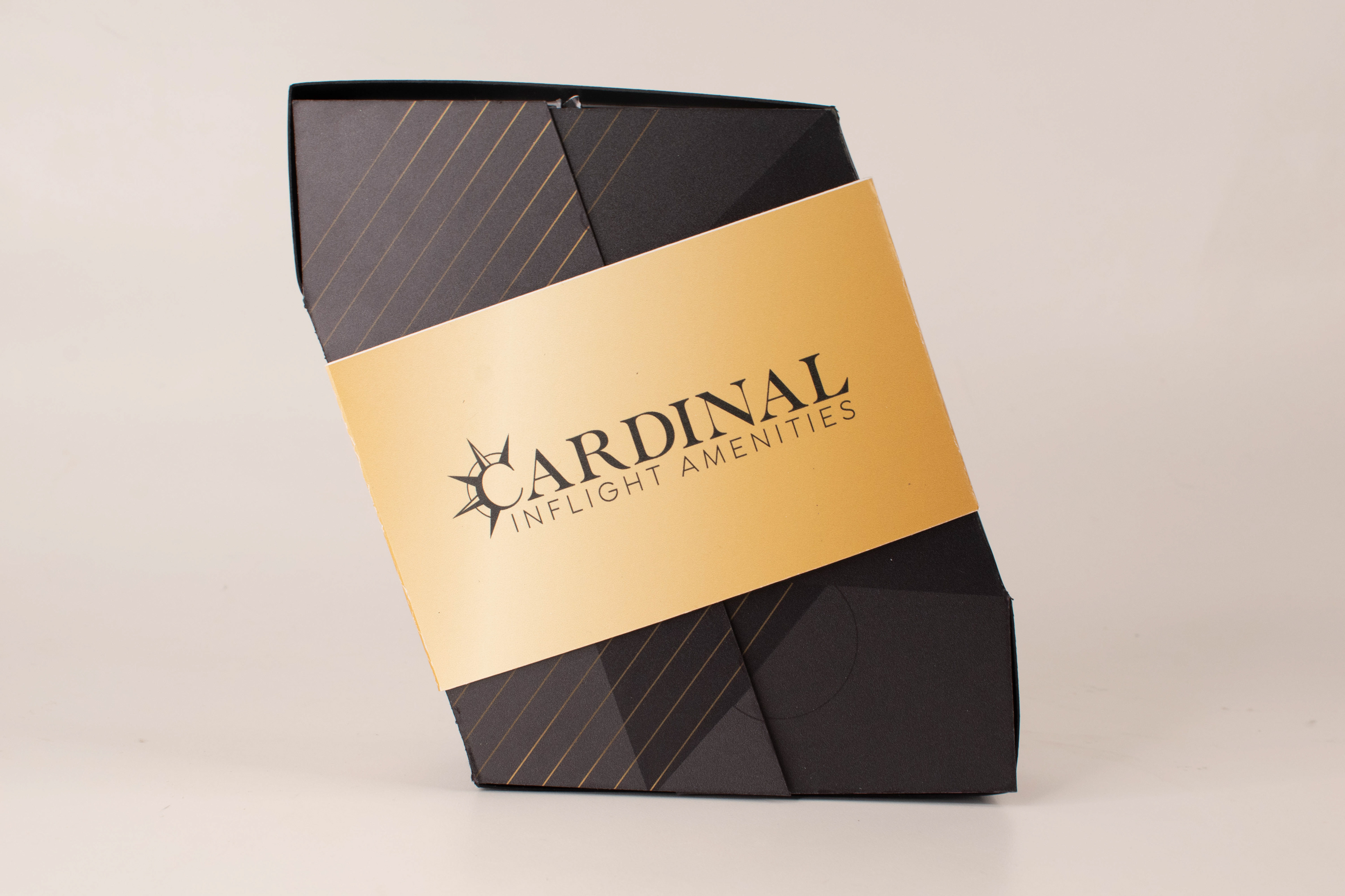
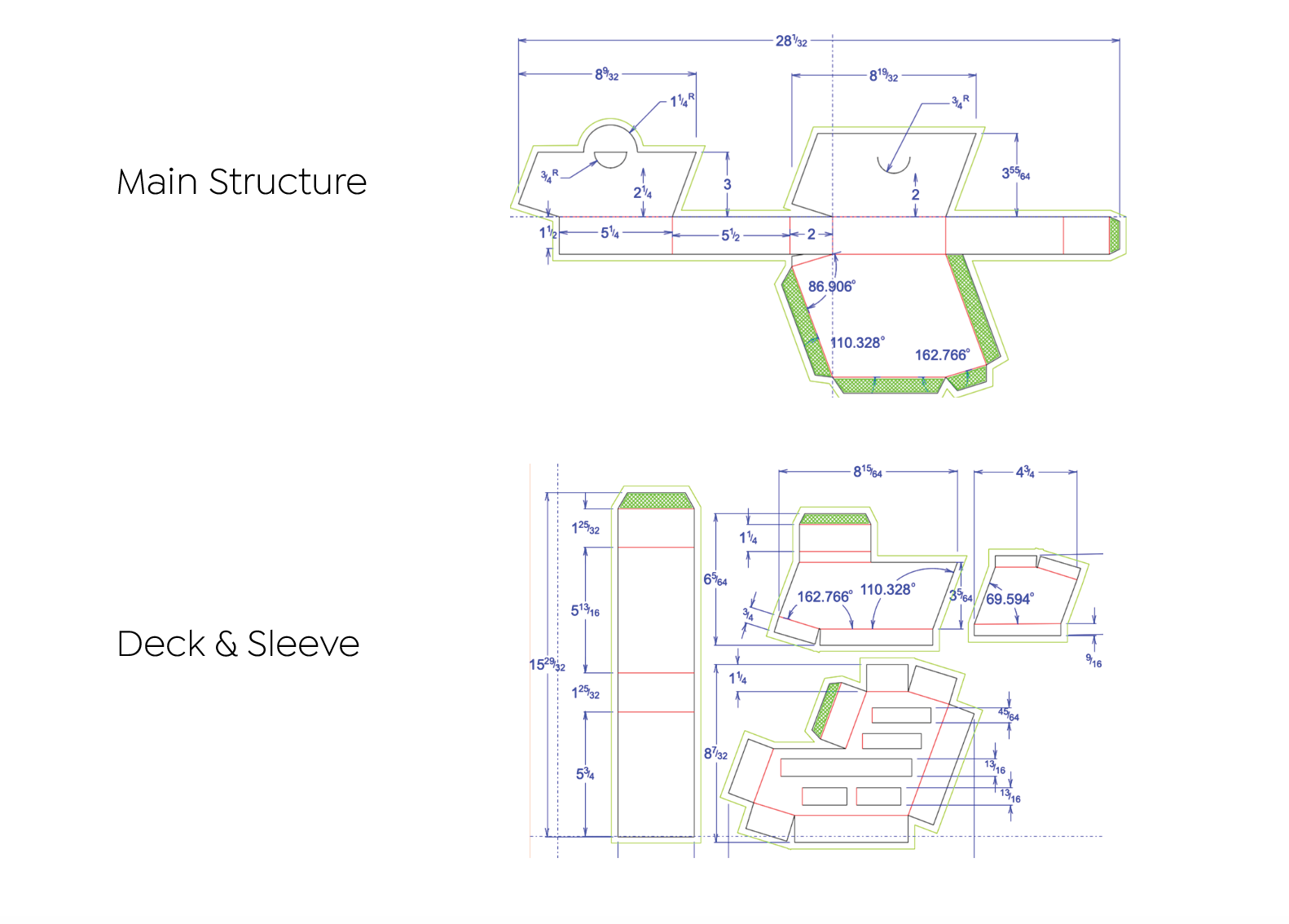
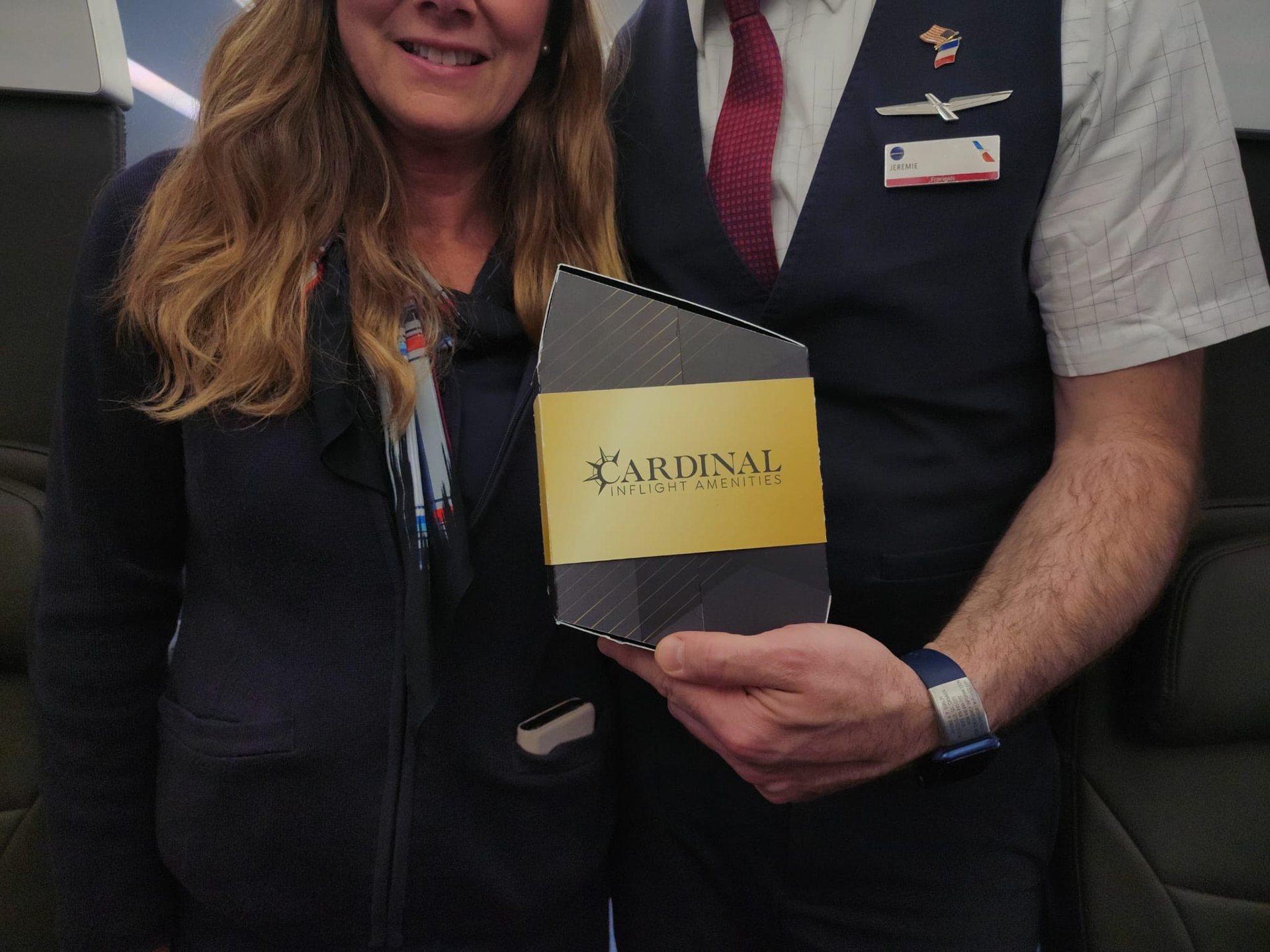
For this project, I came up with the final rhombus-eque shape of the packaging, as well as the brandmark used on the band that holds the packaging.
What is Cardinal?
Cardinal Inflight Amenities serves as a sustainable solution to currently very wasteful in-flight amenities market.
With growth projected through 2028, the industry has failed to consider sustainability a priority, instead favoring disposable products and plastic containers. In order to tackle this pressing issue, we developed Cardinal Flight Amenities, which would be developed with carton composed of post-consumer recycled paperboard, and printed with a soy-based ink.
With growth projected through 2028, the industry has failed to consider sustainability a priority, instead favoring disposable products and plastic containers. In order to tackle this pressing issue, we developed Cardinal Flight Amenities, which would be developed with carton composed of post-consumer recycled paperboard, and printed with a soy-based ink.
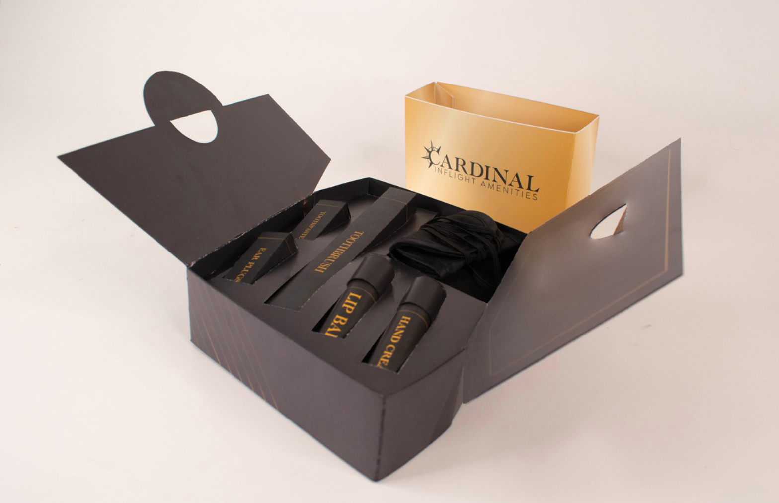
This amenities package would be found on business class, international flights, and provide passengers with convenient toiletries such as a recyclable toothbrush, toothpaste tablets, lip balm, ear plugs, and an eye mask.
Interactive Experience
Cardinal's latched door provides a degree of user interaction not seen in the majority of paperboard packaging. Since this is an airline-based amenity kit, we wanted to emulate the feeling of entering a “new world,” and this latching mechanism adds a heightened level of luxury to the product unboxing experience as there are multiple layers to interact with.
In addition to an interactive opening experience, this opening mechanism provides a sense of confidence in the products inside. The product’s sleeve gives a another level of cleanliness and protection to the kit and the items inside, serving as a seal or potentially a keepsake for the customer.
Concept and Visuals

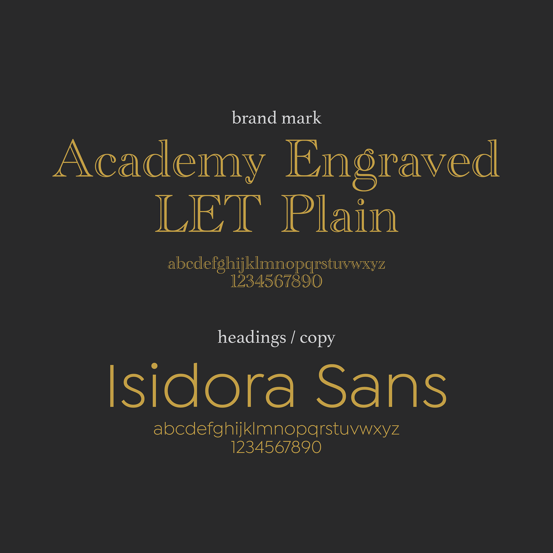

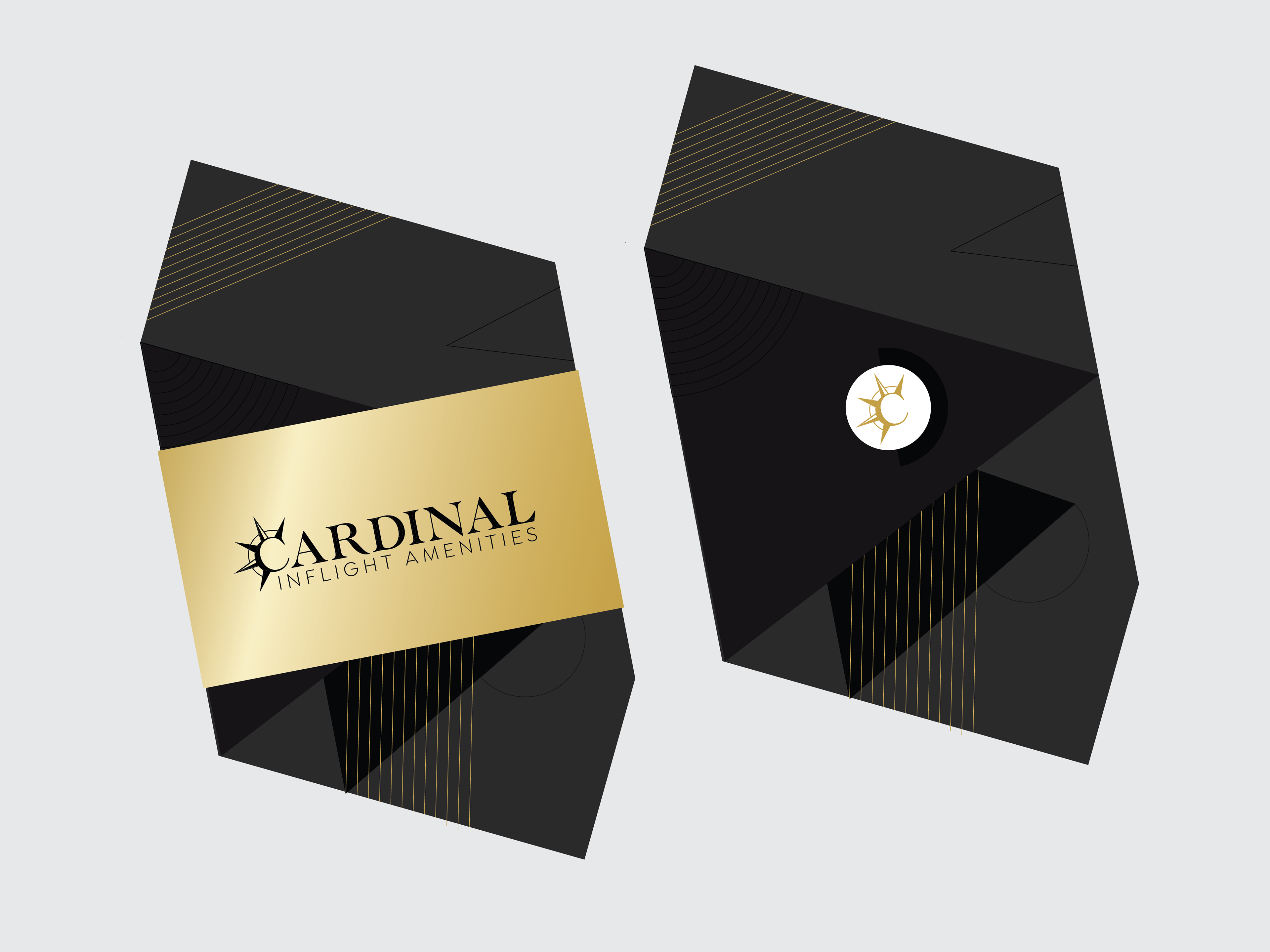
Cardinal Inflight Amenities is meant to be a brand that exudes sleekness to match that business class environment it would be used in. In order to match this tone with our graphics, we chose a charcoal pigment for our base, a darker black to emphasize detail and texture, and gold to serve as a compliment to pull the design together. We wanted our design to echo the luxurious look of the Art Deco era.
Specifically looking at our word mark, we decided to go with the name “Cardinal” because it represents that cardinal directions that people associate with travel, as well as the bird that is commonly connected to devotion and blessings. The spikes seen in the compass rose, which shows that cardinal directions, gave us the perfect opportunity to incorporate a sleek, sharp look to our team’s branding.
Final Structure
Process Work

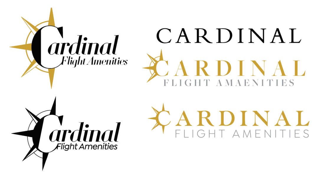
Once we decided on naming our amenities kit "Cardinal", it took a lot of trial and error to figure out how I wanted to convey our package through the brand mark. I knew I wanted to emphasis a level of prestige and elegance, so I honed in on serif, classic-feeling typefaces. I was focused on trying to show the motif of the cardinal bird, but it did not seem to be working as I went through multiple iterations. After discussing with my team members, we decided that focusing on the Cardinal directions through a compass rose motif was a smart direction to go with the brand name, and that lended itself well to a more sophisticated mark.

