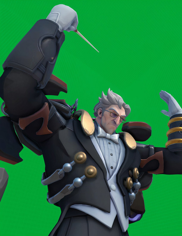
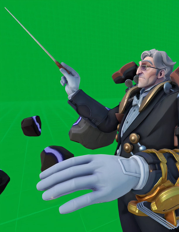
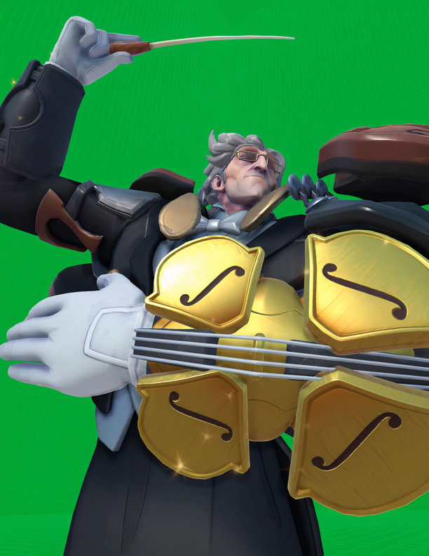
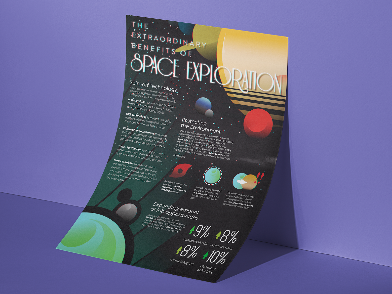
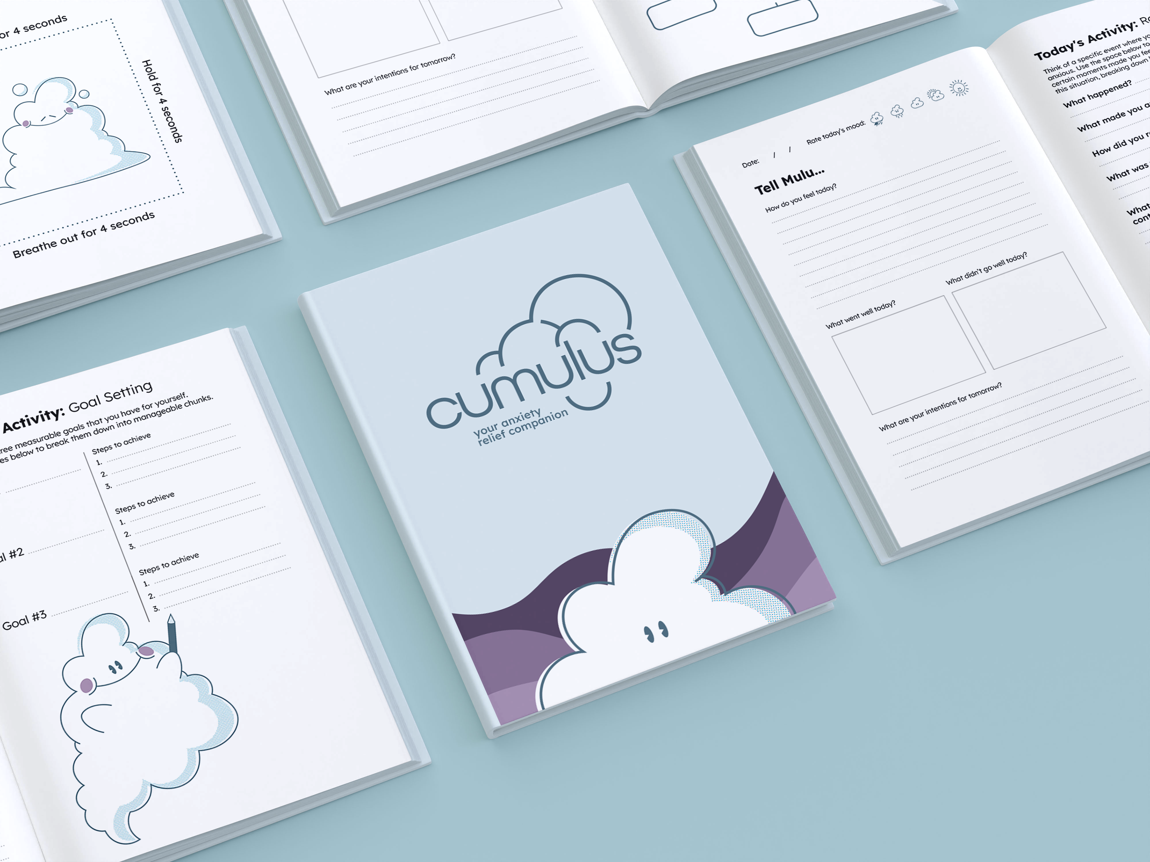
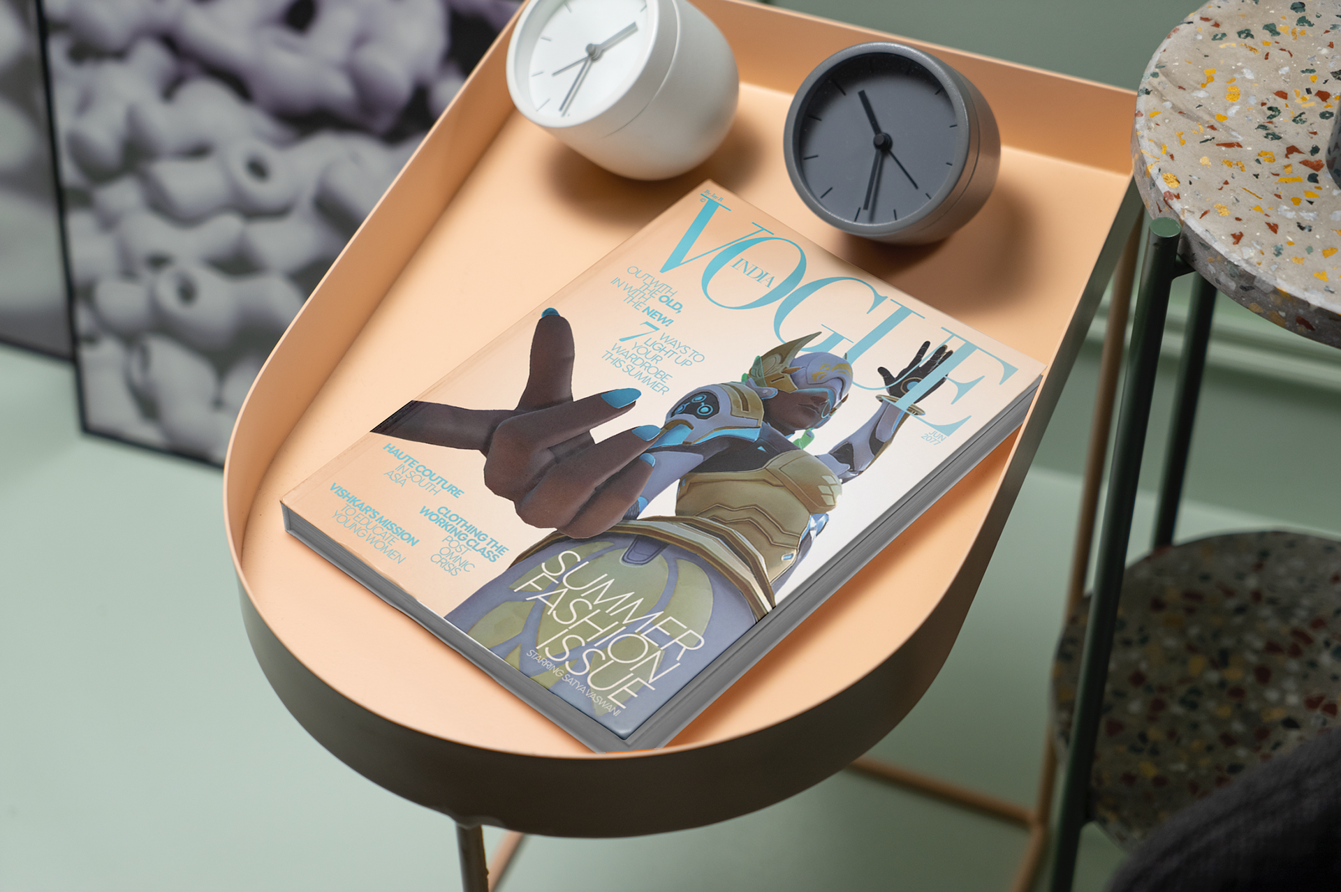
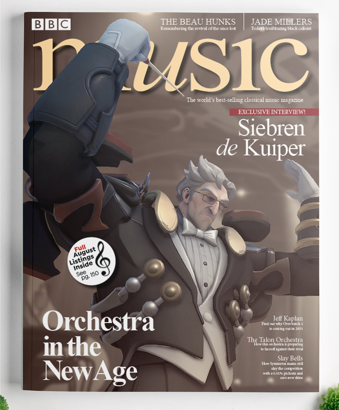
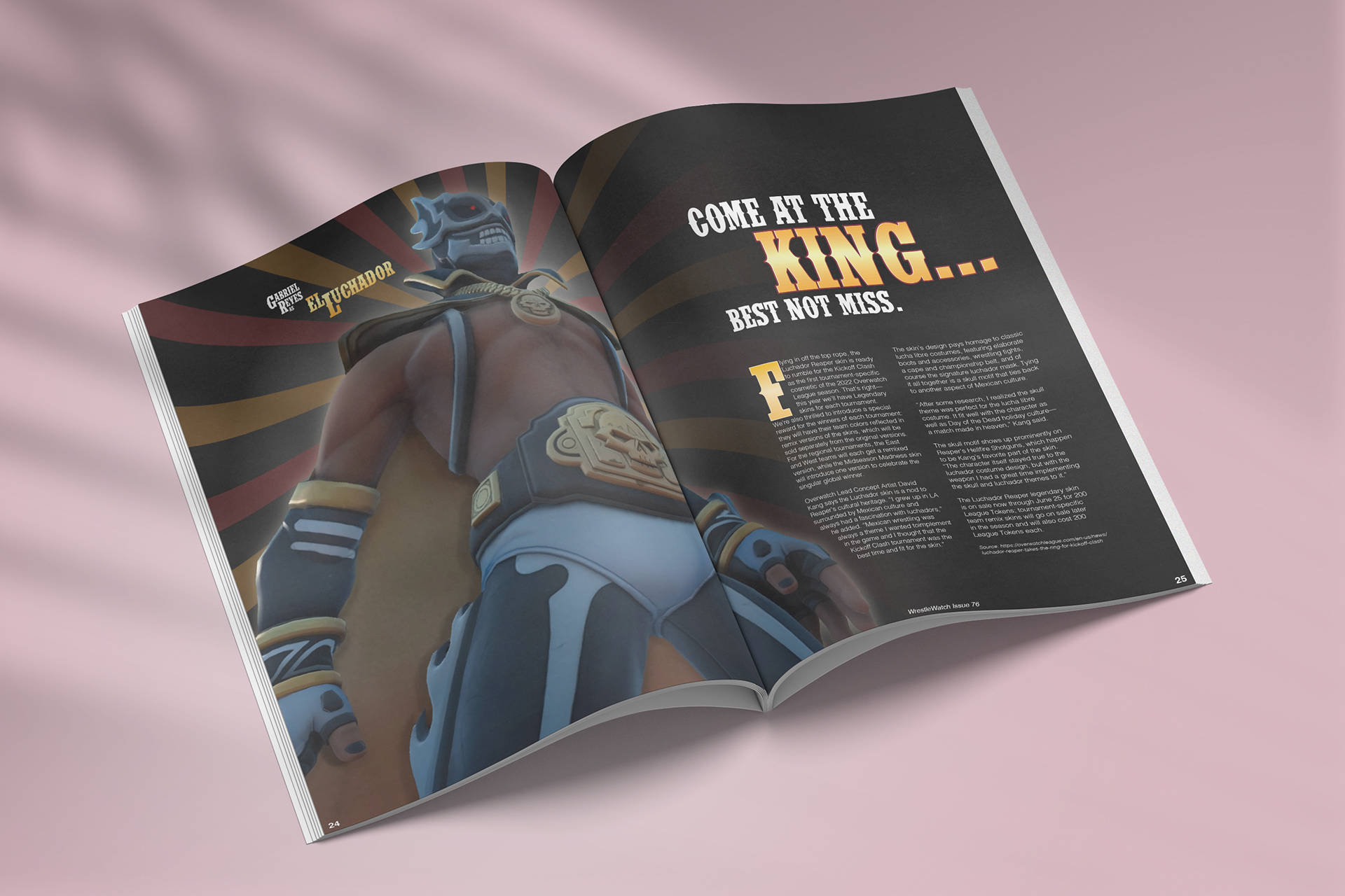
This was a series from a larger scale personal project I did during quarantine. There is a video game I love called Overwatch, and there is a green screen mode that allows you take screenshots of characters from different angles while they do various poses and movements. To hone my design and Photoshop skills, this inspired me to edit them onto different magazine covers and spreads with custom lighting and text, making the end result as true to the real magazines as possible, while also being personalized to the character.
Inspirations
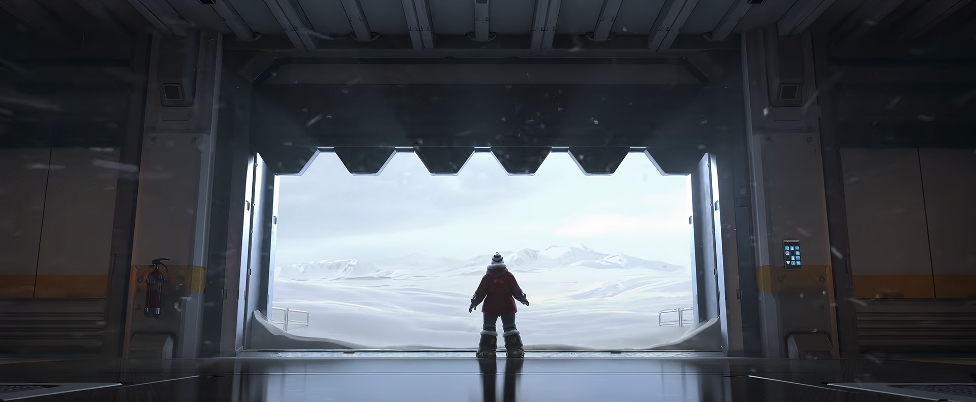
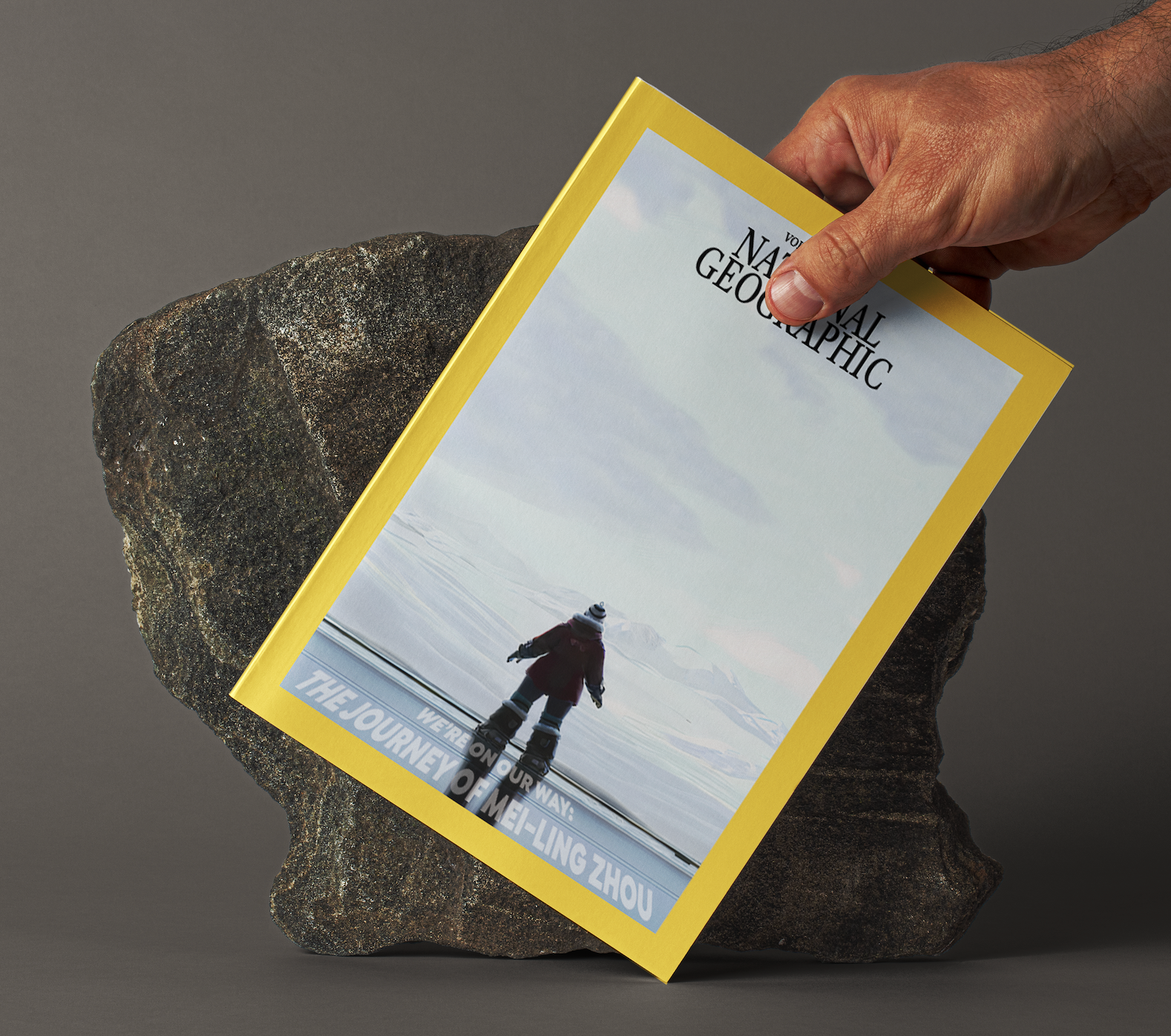
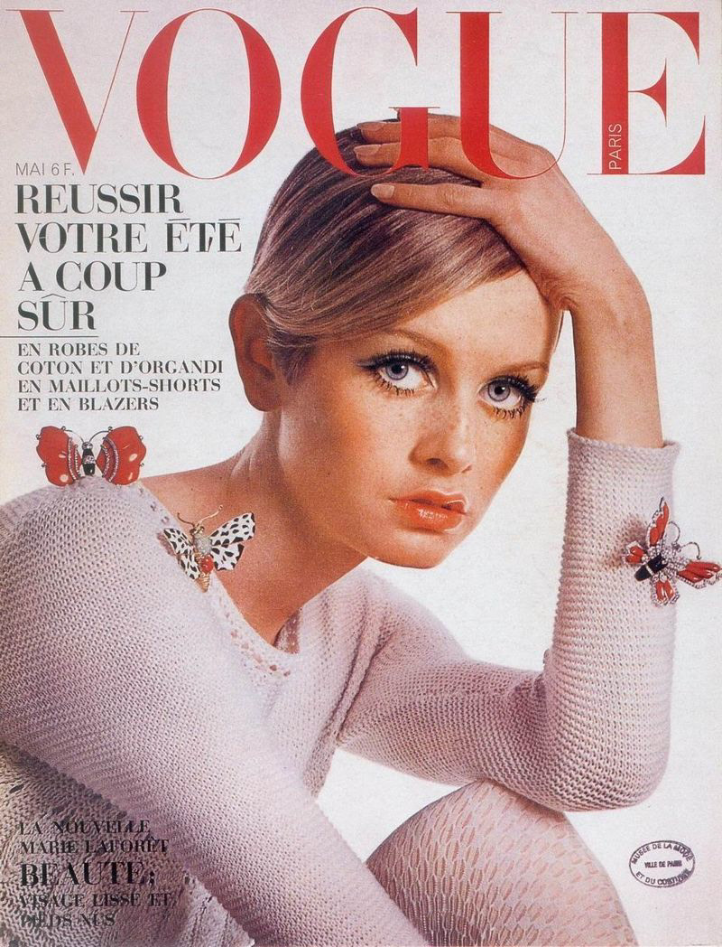
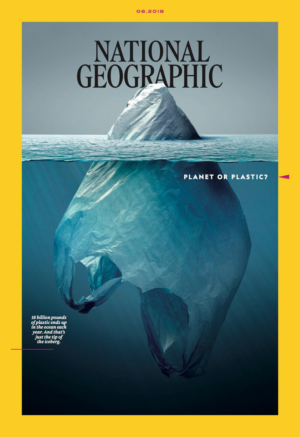
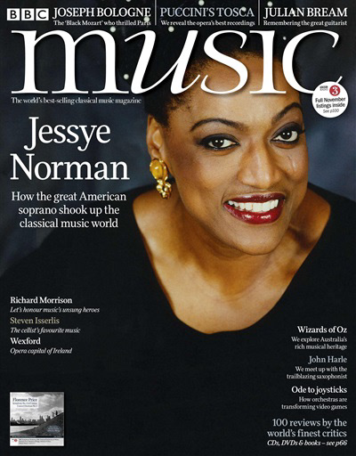
I wanted to look at a variety of types of magazines with different subject matter and layouts. The majority of them have a person or object as the subject, but I wanted to also look at how text is organized around the subject, and how visual hierarchy is handled. As an example, for the "National Geographic" inspired piece, I wanted to have minimal text paired with a strong use of negative space that comes across as impactful or foreboding.
Edited Image Examples
In the game itself, I experimented with different poses to see what would compliment potential text in a way that would lead the viewers eye through the design. For the "National Geographic" design, I used a screenshot from one of the game's animated cinematics, and used editing in order to emphasize the vast, snowy landscape.
